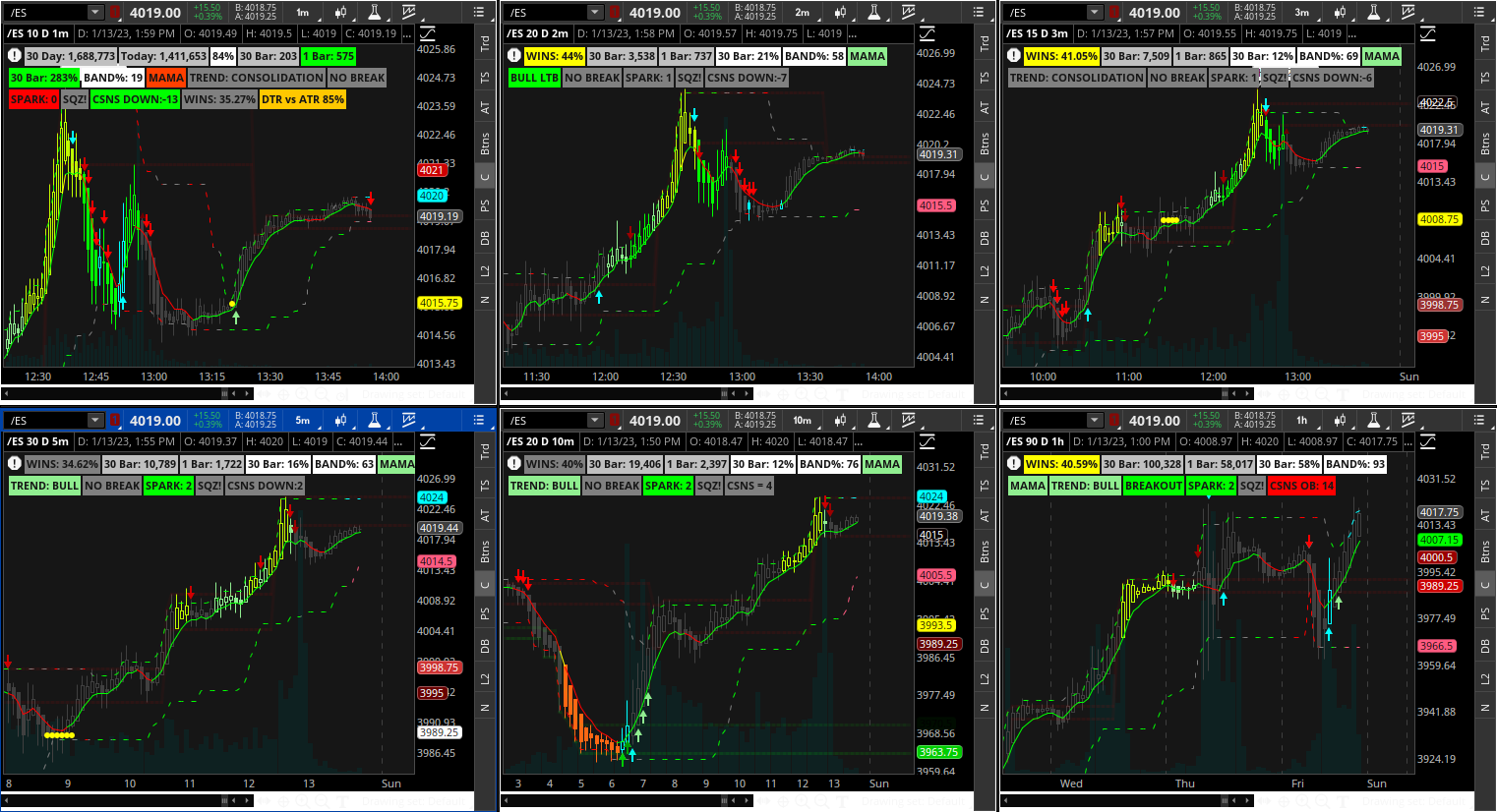
Hey good people... messing with them gridsley bears again... This one I was attempting to make a little less busy with easily visible signals... that being said I am not so sure I accomplished that haha. However... It is the C3_Max_Spark C3_MF_Line and Triple_Exhaustion_MTF (four aggregations) have not used it in live market) (I turned off the C3 Max clouds and set all the supply demand lines transparency at 85%)(have not adjusted the TS_V9 or turned off redundant buy sell volume labels yet)
The real reason for this post is the following:
I never actually paid any attention to this until now... Notice the Near Term levels (From the "Confirmation Candles" study) dashed green, gray, & red lines following the price around) the color of the lines represent the price action
Also, I realized that if using a grid (or not) it is worthwhile to change the EMA length for the "Spark" calculation (specifically changes where the arrows plot) "Average 8" "Average 9" I changed them to 8 and 28 (I need to adjust them for each timeframe but in the following screenshots they are all using the same settings) then I changed the "Near_Term_Levels" displace setting ((***in hindsight this was pointless as the real time benifits of these lines painting essentially void - I have since changed them back to default)) which adjusts how soon you see the colors change (dashed lines)
Updated Sharable link https://tos.mx/z5i5HDg
***Changed label settings and TS_V9 settings for each TF most are pretty good so far
***Changed a few of the charts average 8 and 9
***New Screenshot after changes:

You will see multiple grey dashed lines in the following screenshot - indicating choppy price action:

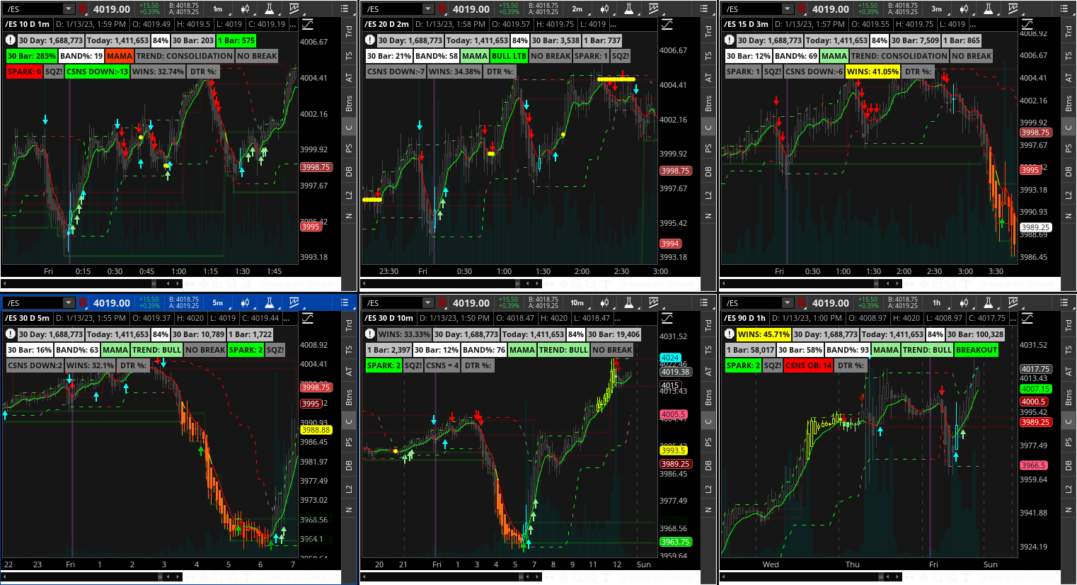
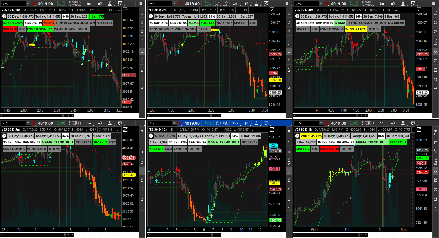
TSV9 and Spark indicating watch for short entry - notice the 10min ATR levels are both red for a safe short entry (also notice the C3 green lines get shorter and shorter between the red lines this is also a good indication of a coming reversal):

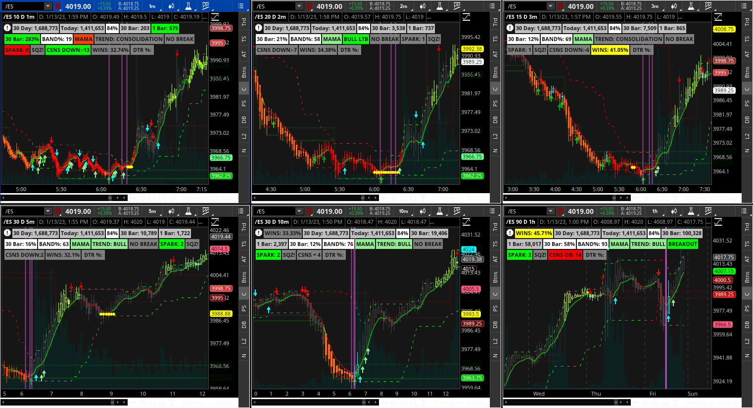
Near perfect long entry:

The real reason for this post is the following:
I never actually paid any attention to this until now... Notice the Near Term levels (From the "Confirmation Candles" study) dashed green, gray, & red lines following the price around) the color of the lines represent the price action
- During a temporary pullback the lines are still green
- When the top and bottom lines are the same color the trend is confirmed
- On the higher (10-15min) timeframes the lines turn gray for a bar or so then change color - the gray bar is a good time to expect reversal
Also, I realized that if using a grid (or not) it is worthwhile to change the EMA length for the "Spark" calculation (specifically changes where the arrows plot) "Average 8" "Average 9" I changed them to 8 and 28 (I need to adjust them for each timeframe but in the following screenshots they are all using the same settings) then I changed the "Near_Term_Levels" displace setting ((***in hindsight this was pointless as the real time benifits of these lines painting essentially void - I have since changed them back to default)) which adjusts how soon you see the colors change (dashed lines)
Updated Sharable link https://tos.mx/z5i5HDg
***Changed label settings and TS_V9 settings for each TF most are pretty good so far
***Changed a few of the charts average 8 and 9
***New Screenshot after changes:
You will see multiple grey dashed lines in the following screenshot - indicating choppy price action:
TSV9 and Spark indicating watch for short entry - notice the 10min ATR levels are both red for a safe short entry (also notice the C3 green lines get shorter and shorter between the red lines this is also a good indication of a coming reversal):
Near perfect long entry:
Last edited:
