Confirmation Candles Indicator For ThinkorSwim

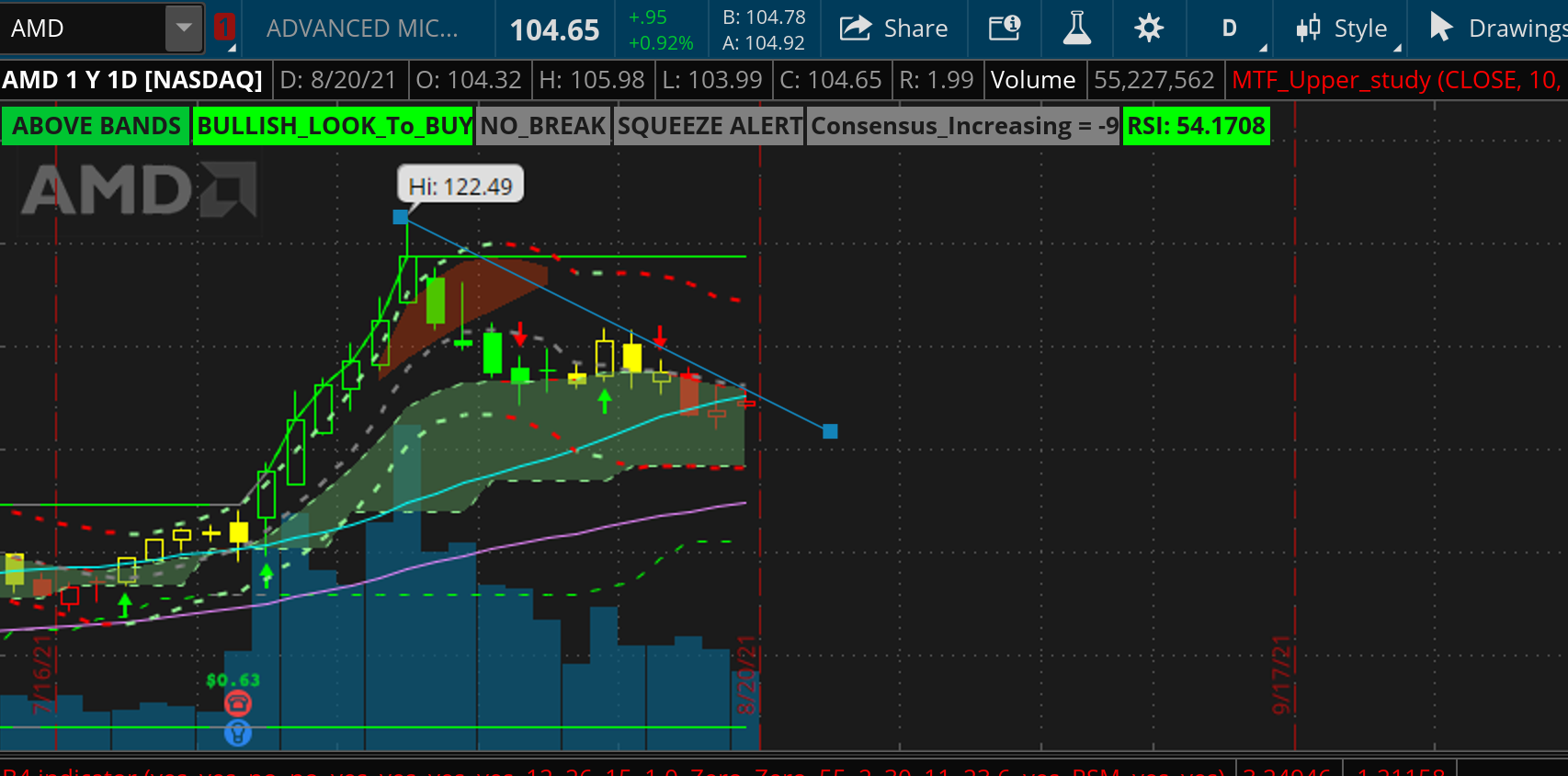
@Christopher84 I was wondering if I could pester you to understand how to read the MTF starc bands better. If you look at the chart below
oLZxjn1.png


The overall channel is green which going by what I have seen is a good indicator still bullish momentum, but the MTF starc bands are red and sloping downwards. How do you interpret that.

Also do the MTF resistance lines turn red when the price is below the MTF clouds or in the clouds (looked at a number of charts) and that is my interpretation.
Hi @alexsmith3546!
It appears that you have the MTF STARC set to the same period as you chart (both on Day), in which case they would be viewed the same way the standard STARC indicator would be. The color of the line is determined by the slope of the line. When the upper band is pointing upward, it will be green, and when pointing down it will be red (this is the same for the lower band). What I am looking for when using this indicator is agreement in the direction of the bands as well as the relative position of price to the bands. I also use the MTF STARC on a larger time frame than the chart I am viewing to give some context to the larger movement in price. In your example, abouth 13 days ago price opened above the OB Cloud (usually a signal that price may reverse or trend sideways near term). The overall trend is bullish, so look for price to gain support. If it finds support, then it poses a possible opportunity for a long entry. If not, the channel will go red representing a bearish change in the overall trend. I hope that helps! Happy trading Alex!
Thank you @Christopher84 , that actually makes a lot of sense and helps me understand how to use the MTF starc bands, now if I change the time frame for the MTF starc bands to weekly rather than daily for the same AMD chart , this what i get

x4ff4tp.png


So looking at this chart, seems like there is support for the stock at at the lower MTF starc level at approximately 101.53 (at the weekly level)(which is where it bounced off) and if the stock breaks past the MTF green cloud, the next level of resistance is about 113 . Would my understanding be correct. Also since the bands are now horizontal for the weekly, would I be right in assuming that they are in a period of consolidation.

That said, I still have some questions about how to read divergences between the daily MTF band and the weekly MTF starc band. Taking this example of AAPL

40l7DyG.png


So would this read as weekly trend is positive but daily trend is bearish

On the flip side,if I take PLTR, would the reading be the daily trend is bullish but the weekly trend or long term trend is negative (since the MTF starc lines are red)

3TpMG1D.png


Apologies for all these questions, This is a marvelous indicator and I am trying to ensure I understand it fully to optimize my trading strategy.
 
Last edited:
Thank you @Christopher84 , that actually makes a lot of sense and helps me understand how to use the MTF starc bands, now if I change the time frame for the MTF starc bands to weekly rather than daily for the same AMD chart , this what i get

x4ff4tp.png


So looking at this chart, seems like there is support for the stock at at the lower MTF starc level at approximately 101.53 (at the weekly level)(which is where it bounced off) and if the stock breaks past the MTF green cloud, the next level of resistance is about 113 . Would my understanding be correct. Also since the bands are now horizontal for the weekly, would I be right in assuming that they are in a period of consolidation.
***The horizontal appearance is an artifact from it being an MTF indicator. Most MTF indicators will have that stairstep appearance. It doesn't mean that it is in consolidation
necessarily. I'm curious what you are using to paint your candles(doesn't look like C3)?

That said, I still have some questions about how to read divergences between the daily MTF band and the weekly MTF starc band. Taking this example of AAPL

40l7DyG.png


So would this read as weekly trend is positive but daily trend is bearish
***Basically yes.
On the flip side,if I take PLTR, would the reading be the daily trend is bullish but the weekly trend or long term trend is negative (since the MTF starc lines are red)

3TpMG1D.png


Apologies for all these questions, This is a marvelous indicator and I am trying to ensure I understand it fully to optimize my trading strategy.
No worries about the questions. Keep trying to learn all that you can. There's a lot of information to digest on these charts. Sometimes it's best to limit the number of indicators you are using on a single chart. It can help to paint a clearer picture.
PS- I just noticed an issue with the painting of the MTF STARC that I just corrected. I would recommend reloading the code on pg.1 now that it is corrected. Sorry about that.
 
Last edited:
No worries about the questions. Keep trying to learn all that you can. There's a lot of information to digest on these charts. Sometimes it's best to limit the number of indicators you are using on a single chart. It can help to paint a clearer picture.
PS- I just noticed an issue with the painting of the MTF STARC that I just corrected. I would recommend reloading the code on pg.1 now that it is corrected. Sorry about that.

Thanks @Christopher84 , after more backtesting, this is the strategy which works well for me on the day chart
  1. Buying calls or stocks when i see an up arrow and its above the MTF cloud and its the green channel, even more when i see it breaking the interim resistance as it shows strong support
  2. Buying puts when I see the break below the MTF cloud in a red channel
  3. Buying puts when the stock has been over the red cloud, this has been incredibly effective
  4. Buying calls and stocks when the cloud is the MTF cloud and in a green channel, more often than not there is a reversal though I did notice there was some risk with this approach since a really strong seller can completely move the stock into a red channel.

    Looking at this strategy, the MTF cloud, the consensus candles and the B4 indicator below are fantastic to determine what go for and are now the basis of my charts. That said, I noticed that the MTF starc lines also act as resistance\support lines at times. Would that be the right assumption ?

    Apologies for the late response, been slammed at work this week.
 
Christopher84
I have been studying your indicator and it is very interesting. I am beginning to understand it and has helped me on two trades to enter at the right time, and also stay in them. I use BTD, and AMM 2.0 for finding trades, and then use CC to further study them. I congratulate you on your extensive work. Looking forward to learning more.
 
I think the best idea is to give you the components of the scan so you are able to setup instead of relying on the share link. So here are the codes I am using to do the scan with images to show my settings.
Code:
# MTF Moving Average Cloud Scan Day (For Scan Only)

declare lower;
input length = 10;
input agperiod1 = {"1 min", "2 min", "5 min", "10 min", "15 min", "30 min", "1 hour", "4 hours", default "Day", "Week"};
#input agperiod2 = {"1 min", "2 min", "5 min", "10 min", "15 min", "30 min", "1 hour", "4 hours", "Day", default "Week"};

plot avg1 = ExpAverage(close(period = agperiod1), length);
def height = avg1 - avg1[length];
avg1.SetStyle(Curve.SHORT_DASH);
avg1.SetLineWeight(1);
#avg.SetDefaultColor(Color.Gray);
plot UP1 = avg1[1] < avg1;
def DOWN1 = avg1[1] > avg1;
Avg1.AssignValueColor(if UP1 then Color.LIGHT_GREEN else if DOWN1 then Color.RED else Color.YELLOW);

#plot avg2 = ExpAverage(close(period = agperiod2), length);
#def height2 = avg2 - avg2[length];
#avg2.SetStyle(Curve.SHORT_DASH);
#avg2.SetLineWeight(1);
#avg.SetDefaultColor(Color.Gray);

#def UP2 = avg2[1] < avg2;
#def DOWN2 = avg2[1] > avg2;
#Avg2.AssignValueColor(if UP2 then Color.LIGHT_GREEN else if DOWN2 then Color.RED else Color.YELLOW);

plot price1 = close;
def UP3 = price1[1] < price1;
def DOWN3 = price1[1] > price1;
price1.AssignValueColor(if UP3 then Color.LIGHT_GREEN else if DOWN3 then Color.RED else Color.YELLOW);


#AddCloud(avg2, avg1, Color.LIGHT_RED, Color.CURRENT);
#AddCloud(avg1, avg2, Color.LIGHT_GREEN, Color.CURRENT);
YV9bL9B.png

Xr7InFZ.png


Here's the MA Week scan component.
Code:
# MTF Moving Average Cloud (For Week Scan Only)

declare lower;
input length = 10;
#input agperiod1 = {"1 min", "2 min", "5 min", "10 min", "15 min", "30 min", "1 hour", "4 hours", default "Day", "Week"};
input agperiod2 = {"1 min", "2 min", "5 min", "10 min", "15 min", "30 min", "1 hour", "4 hours", "Day", default "Week"};

#plot avg1 = ExpAverage(close(period = agperiod1), length);
#def height = avg1 - avg1[length];
#avg1.SetStyle(Curve.SHORT_DASH);
#avg1.SetLineWeight(1);
#avg.SetDefaultColor(Color.Gray);
#def UP1 = avg1[1] < avg1;
#def DOWN1 = avg1[1] > avg1;
#Avg1.AssignValueColor(if UP1 then Color.LIGHT_GREEN else if DOWN1 then Color.RED else Color.YELLOW);

plot avg2 = ExpAverage(close(period = agperiod2), length);
def height2 = avg2 - avg2[length];
avg2.SetStyle(Curve.SHORT_DASH);
avg2.SetLineWeight(1);
avg2.SetDefaultColor(Color.Gray);

plot UP2 = avg2[1] < avg2;
def DOWN2 = avg2[1] > avg2;
Avg2.AssignValueColor(if UP2 then Color.LIGHT_GREEN else if DOWN2 then Color.RED else Color.YELLOW);

plot price1 = close;
def UP3 = price1[1] < price1;
def DOWN3 = price1[1] > price1;
price1.AssignValueColor(if UP3 then Color.LIGHT_GREEN else if DOWN3 then Color.RED else Color.YELLOW);


#AddCloud(avg2, avg1, Color.LIGHT_RED, Color.CURRENT);
#AddCloud(avg1, avg2, Color.LIGHT_GREEN, Color.CURRENT);
xbKr3Cm.png

Here are the results of my scan this morning.
R68x7eC.png

Let me know if you have any trouble setting it up. I had to break the code up a bit due to it being an MTF indicator.
Found this to be an awesome scan though I was wondering if there is a way to run this for a shorter time frame (15m or 30m) and if so, how. Would appreciate any guidance on that and apologies in advance if this has been clarified earlier (a pointer/link would help if so)
 
@Christopher84 on the B4 lower indicator, is there a way to make a watchlist column that shows when the dotted line, the one that changes colors (green, gray, red), crosses above or below the green line of the band? That would be a great addition to this strategy. My buy indicators in the watchlist always show the stock has crossed above that line several bars before which is missing out on much of the move upward.
 
Hello everyone.
I believe I might have read this before somewhere, but is there a scanner for this study? Also is there a way to scan for red candles approaching the green support lines?
Thanks for any help
 
Hi @Christopher84 . I just saw this shared link. I really like it. What's the difference between this and Consensus Candles v6? It seems like this share link arrow plot at perfect spot. Any info is greatly appreciated.
Hi @s1111,
I wouldn't use this version of the study. It has potential for repainting (probably the reason all the arrows look to be in the perfect spot). I removed that from the code to prevent any possibility of repainting.
 
@Christopher84 on the B4 lower indicator, is there a way to make a watchlist column that shows when the dotted line, the one that changes colors (green, gray, red), crosses above or below the green line of the band? That would be a great addition to this strategy. My buy indicators in the watchlist always show the stock has crossed above that line several bars before which is missing out on much of the move upward.
Hi @FreefallJM03,
I'm sorry but I do not have a WL code for the B4 system.
 
Hi @s1111,
I wouldn't use this version of the study. It has potential for repainting (probably the reason all the arrows look to be in the perfect spot). I removed that from the code to prevent any possibility of repainting.
Hi @Christopher84 . Thanks for getting back. That's too bad bro, I like the way it works. Hopefully, you can make this script work better. This morning I was looking at TSLA with your script, Spot on. I see potential, Keep up the good work!!
 
Hi @Christopher84 I'm wondering when load the XConfirmationLower it flattens out? I can manually adjust it but I'm having to do it every time. Thanks for the great scripts, they've truly helped me.

Screen-Shot-2021-09-07-at-1-51-40-PM.png

2012 vw gti 1 4 mile
Hi @Konger37,
It looks like you have something wrong in your settings. Do you possibly have to indicators active in the same lower study slot? Something is throwing your scale off. It should never look that way. Try taking off all other lower studies until you find the culprit.
 

Join useThinkScript to post your question to a community of 21,000+ developers and traders.

Not the exact question you're looking for?

Start a new thread and receive assistance from our community.

87k+ Posts
466 Online
Create Post

The Market Trading Game Changer

Join 2,500+ subscribers inside the useThinkScript VIP Membership Club
  • Exclusive indicators
  • Proven strategies & setups
  • Private Discord community
  • ‘Buy The Dip’ signal alerts
  • Exclusive members-only content
  • Add-ons and resources
  • 1 full year of unlimited support

Frequently Asked Questions

What is useThinkScript?

useThinkScript is the #1 community of stock market investors using indicators and other tools to power their trading strategies. Traders of all skill levels use our forums to learn about scripting and indicators, help each other, and discover new ways to gain an edge in the markets.

How do I get started?

We get it. Our forum can be intimidating, if not overwhelming. With thousands of topics, tens of thousands of posts, our community has created an incredibly deep knowledge base for stock traders. No one can ever exhaust every resource provided on our site.

If you are new, or just looking for guidance, here are some helpful links to get you started.

What are the benefits of VIP Membership?
VIP members get exclusive access to these proven and tested premium indicators: Buy the Dip, Advanced Market Moves 2.0, Take Profit, and Volatility Trading Range. In addition, VIP members get access to over 50 VIP-only custom indicators, add-ons, and strategies, private VIP-only forums, private Discord channel to discuss trades and strategies in real-time, customer support, trade alerts, and much more. Learn all about VIP membership here.
How can I access the premium indicators?
To access the premium indicators, which are plug and play ready, sign up for VIP membership here.
Back
Top