D@nDigital
New member
Hello All, I’m new to this forum (First Post!) and TOS, but not new to investing in stocks. I apologize in advance if some of the images look small as this is my first post. I’ve been watching a few threads over the past few weeks and doing my best to employ the ideas I think would fit into how I like to trade. Mainly the combo of the Moxie indicator & Trend Trader Pro strategies is what I’ve been employing recently with some success. I am fascinated by the technical analysis aspect of trading and believe I’ve found a good way to day-trade/swing-trade using a combo of some of the indicators and scanners from the following two forum threads:
https://usethinkscript.com/threads/completed-heikin_ashi-indicator.5251/
https://usethinkscript.com/threads/moxie-indicator-for-thinkorswim.369/
Thank you, @BonBon & @tradegeek, for starting/contributing to these threads along with the brilliant work/contributions of others like @Slippage @AspaTrader @MerryDay @VictusJogi @J007RMC @RickK @Alb @germanburrito @Homemadeitmyself @Ghs @floydddd @irishgold @rlohmeyer (along with countless others) who made these threads better by refining code, helping with scanners/watchlists, and asking great questions. @BenTen, your indicators also fit the spirit of what I’m trying to accomplish here. I would love for your eyes to take a look at this as well if you think it’s worthy of your time.
I am no coder by any means, and I know there are brilliant people on this forum who can help bring the ideas in my head into fruition, make them better, and hopefully benefit in the process.
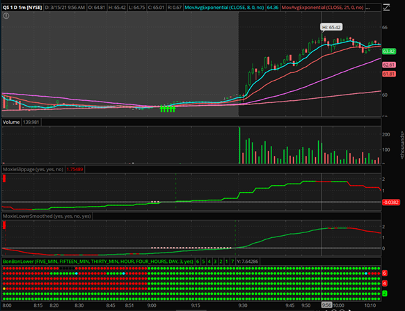
I’ll start with an easy example on the chart below of ticker QS. (My Current Workspace Link if you want to see my current chart setup: https://tos.mx/D5H5YNS)
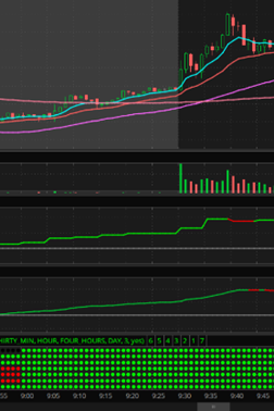
In the chart below, you’ll notice that at around 9 am, both @Slippage indicators are green and close to the zero line, @BonBon’s MTF indicators are all green, and we’re hovering around the 200 SMA line. This would be a near-perfect entry. The only thing more perfect would be if the @Slippage indicators were both green and above the 0 line. So, let’s say you entered at the start of this trend at around $59. Theoretically, you would ride this all the way up to around $64-$65, which is when the first @Slippage indicator turns red and to me would signal the beginning of a trend reversal and potentially a great time to take profits and exit. The 2nd @Slippage indicator shortly turns red afterward, confirming that a trend reversal might be near, another opportunity to exit. Luckily for those who still had the nerve to hang in there knowing that the trend, even though red on the @Slippage indicator is still very high above the 0 line, we're able to see both indicators become green again and go back up to $65. Then both indicators turn red again, another signal of a trend reversal/take profit exit opportunity if you’re still in. If you still haven’t sold, then your sell signal would come when both @Slippage lines are red, and the 5-minute @BonBon indicator starts turning light blue then red in this case. At this point, you’d still be out safely with around a $4-5 gain per share in about an hour.
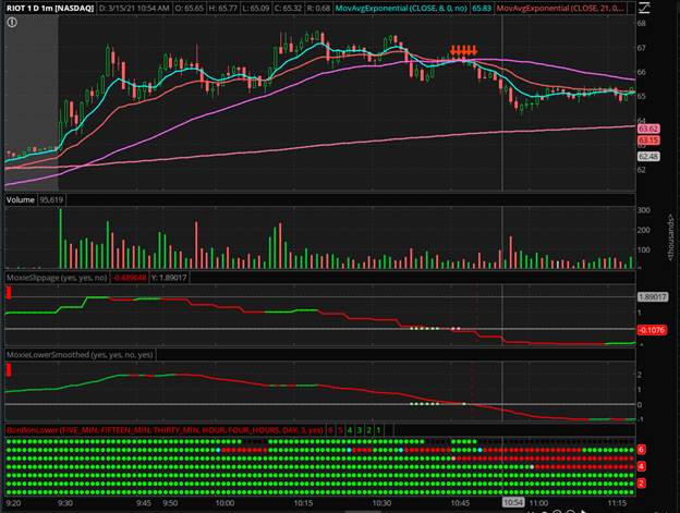
Now let’s look at a RIOT chart and look for a re-entry opportunity after the first sell signal while we’re still in the heavier volume period before 11 am. At around 10:10 am, you’ll notice both slippage indicators start turning green again, and all the @BonBon MTF bubbles are green…Theoretically, you can re-enter under these conditions and again apply the same rules as above to signal trend reversals/take profit exit opportunities. So, in this 2nd sequence, you would get 3 trend reversal/take profit messages before you get the hard sell at around 10:20 ish when the @BonBon MTF 5-minute bubbles change from green to blue/red. Now you’re safely out with both @Slippage indicators in red and slowly heading down below zero. At around 10:45, the @Slippage indicator is below 0, and that’s where you see that series of red arrows. This would be considered a Strong sell no matter what, and as you’ll notice, the price dropped sharply afterward.
I will give more examples later, but I just wanted to give you the gist of what I’m trying to accomplish here and then move onto the nuances which must be accounted for.
Overall Objective: To create labels on the top chart that indicate what actions to take in real-time based on the @BonBon and @Slippage indicators and any additional factors we believe might make these signals more reliable while keeping the chart as clean looking/low-noise as possible.
Buy Types/Levels(Open to adding more if you see more intricate patterns)
Sell Types/Levels(Open to adding more if you see more intricate patterns)


So, as you can see, there are many ways a buy or sell trigger can be generated with these indicators, which I believe is a good thing because you can manage your risk with the varying degrees of buys and sells along with different timeframes. I’m sure there are many more scenarios that could constitute a buy/sell signal, but these are the types of buys and sells I’ve identified as patterns so far. There could also be many more factors put into play by utilizing the moving averages to make better buy/sell decisions (ex. maybe only take trades and give buy signals above the 200-day moving avg etc.?), Fibonacci levels, last high, last low’s and whatever you guys think might help make a better trade in tandem with the two main indicators, all while keeping the chart clean, easy to read and easy to react to. Or maybe incorporate those things into risk levels that will give a signal based on whether the price is above or below these moving averages etc. Everything and anything is fair game so long as it gives you one clean view of the chart and lets you know what kind of trade you could potentially be getting into risk-wise.
Considerations-
Repainting – I believe that @Slippage indicator with the ladders (not smoothed) repaints, so does the @BonBon MTF indicator, so what could seem like a good trade and holding pattern one second could be a very different scenario if you’re dealing with a stock that has relatively high volume and volatile swings that day.
If anyone here can create @Bonbon’s lower MTF indicator without the repainting (if possible), that would help make for more solid buy/sell entry/exit points and make looking at past data more reliable to determine proper entry/exit points.
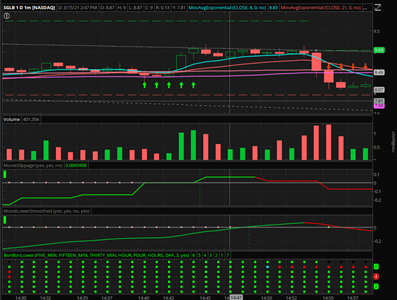
A case in point would be this chart below—high relative volume for SGLB on 3/15/2021 due to news catalyst. Buy signal happens at around 2:30 pm, and all is looking steady with a nice bump up in price around 2:43 pm as it crosses the @Slippage 0 line…all is looking good, all green indicators until the price immediately drops by 50 cents 2:54 pm and then turns the top @Slippage indicator red very far back behind till about 2:50 pm as well as turning the @BonBon indicator light blue then red starting at 2:50 pm as well (Repaint)…Smoothed @Slippage indicator stays true to the past few minutes and does not repaint. Because the drop happens almost instantaneously, the indicator gave no signs that this was going to happen…because the stock was so high volume, the only things you could have done to get out of that in time was to A) set a stop/trailing stop, or B) say to yourself that you don’t like two red candles in a row…C) Don’t trade highly volatile stocks with high relative volume after a certain hour in the day. I’ve replayed the moment OnDemand multiple times, and there’s nothing I could have done to avoid that because it happened in less than a second.
Smoothed Candles? – I love the look and simplicity of smoothed candles of the same color to indicate buy/sell trends on the chart. However, the biggest drawbacks for me on @BonBon’s upper chart with the smoothed candles is that the price is based on Heikin Ashi candles which don’t reflect the true current price, and most times seem to offer entries and exits that are too late if you’re only relying on the chart and no other indicators to make your buy/sell decisions (She mentions this as well in her post). If there is a way to make everything look smoothed, whether it is candles or a line while reflecting the true price, I’m all for whatever will make it easier to make the right choice at the right time, whether it’s buying, selling, or continuing to hold your position. As long as we’re always dealing with buy/sell triggers & labels based on actual real-time prices, candle look is not important, only for looks really.
Triggers – Would Buy/Sell labels be confirmed on the next candle but start showing up in the current candle whenever conditions are met? Repainting throws a wrench into this part.
Timeframes – ideally, this would work on any timeframe you wish to trade on, but if that is not possible, maybe go in between 1minute to 1day and intervals for the candles? So that means all indicators, scanners, and watchlists would have to function correctly on all these timeframes.
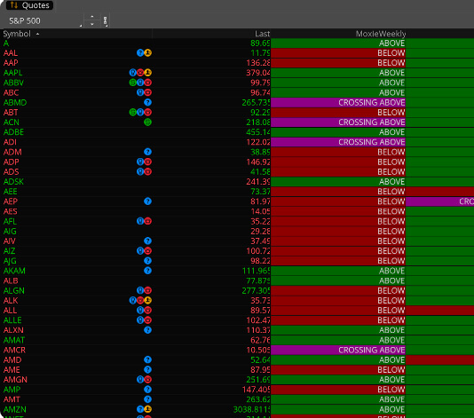
Scanners & Watchlists – Once a solid strategy is made and backtests successfully, scanners should be made to reflect all buy/sell status variations per time frame. This way, anyone can choose to trade risk levels they are comfortable within the time frames they are comfortable trading in. For example, if you only want to trade buys and strong buys on a 5-minute chart, you’ll only see those stocks that fit that criteria, or if you want to see the range of buy/sell statuses, that would be possible too. You could scan for all stocks or just ones from any segmented watchlist in your TOS. Any other creativity or items to add to the scanner’s reliability, efficacy and simplicity would be amazing to add. Also, maybe scanners for trampoline setups (Moxie) as well per timeframe. @BonBon has a great watchlist for her indicators. Something similar with all of the data points of this idea would be awesome to present all opportunities available during the entire trading day, which is what I envision.
Example scanner for @BonBon lower indicator
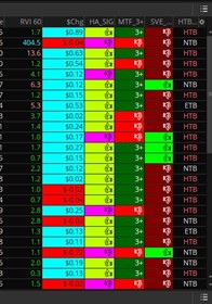
Example scanner for @Slippage indicators
More examples:
LYFT 3/15/2021 –
QS - 3/16/2021 –
In conclusion, I hope I have demonstrated the framework of a winning system. I’m sure I’m probably missing a few nuts and bolts here and there, but the framework is solid, in my view. I believe that the combination of on-chart buy/sell signals/labels and the right scanners/watchlists to find the right opportunities during the trading day can prove to be a profitable system that will leave little to the user besides deciding how much risk they can handle per trade. I would be eternally grateful for your collaboration in making a good system great and easier to implement.
If you have any questions I'll do my best to help elaborate wherever I can...
Appreciate your brains and talent. I hope this leads to something we can all be proud of and use. Cheers!
https://usethinkscript.com/threads/completed-heikin_ashi-indicator.5251/
https://usethinkscript.com/threads/moxie-indicator-for-thinkorswim.369/
Thank you, @BonBon & @tradegeek, for starting/contributing to these threads along with the brilliant work/contributions of others like @Slippage @AspaTrader @MerryDay @VictusJogi @J007RMC @RickK @Alb @germanburrito @Homemadeitmyself @Ghs @floydddd @irishgold @rlohmeyer (along with countless others) who made these threads better by refining code, helping with scanners/watchlists, and asking great questions. @BenTen, your indicators also fit the spirit of what I’m trying to accomplish here. I would love for your eyes to take a look at this as well if you think it’s worthy of your time.
I am no coder by any means, and I know there are brilliant people on this forum who can help bring the ideas in my head into fruition, make them better, and hopefully benefit in the process.
I’ll start with an easy example on the chart below of ticker QS. (My Current Workspace Link if you want to see my current chart setup: https://tos.mx/D5H5YNS)
- We have a normal 1-minute candle chart, no Heikin Ashi or smoothed HA candles because I prefer to view real prices on the chart. On the chart, I have the following moving averages
- 8 day moving avg exponential
- 21 day moving avg exponential
- 50 day moving avg simple
- 200 day moving avg simple
- Wedges by @AspaTrader from @BonBon’s thread
- Support & Resistance lines by @AspaTrader from @BonBon’s thread
- The 1st indicator is the @Slippage momentum indicator that indicates a positive (Green) or negative (Red) momentum at any given time. When the indicator is above zero, momentum is very positive, and the higher above 0, the better. And conversely, when below 0, that means you need to be careful because momentum isn’t great at the moment.
- The middle indicator is the @Slippage momentum indicator smoothed and has a slightly different formula, so it doesn’t turn red/green exactly at the same time as the 1st indicator, sometimes turns green/red earlier or later than the other one, and doesn’t repaint which is good.
- The bottom indicator in this chart is the @BonBon lower multiple time frame indicator which is great for getting an overall picture of where the stock is on longer time frame charts without having to look at 6 charts at a time. It tracks 5min, 15min, 30min, 1hr, 4hr & 1D timeframes with different color dots, green being the best and red being the worst with a color range in between. The top indicator bubble turns green when 5 of 6 time frames are green (in some cases, it’s also black when 5 are green, so not sure what the exact rules are, @BonBon if you can explain exactly how this works, that will be a huge help!), empty when 2 /4 green or red, red when 5 red or more.
In the chart below, you’ll notice that at around 9 am, both @Slippage indicators are green and close to the zero line, @BonBon’s MTF indicators are all green, and we’re hovering around the 200 SMA line. This would be a near-perfect entry. The only thing more perfect would be if the @Slippage indicators were both green and above the 0 line. So, let’s say you entered at the start of this trend at around $59. Theoretically, you would ride this all the way up to around $64-$65, which is when the first @Slippage indicator turns red and to me would signal the beginning of a trend reversal and potentially a great time to take profits and exit. The 2nd @Slippage indicator shortly turns red afterward, confirming that a trend reversal might be near, another opportunity to exit. Luckily for those who still had the nerve to hang in there knowing that the trend, even though red on the @Slippage indicator is still very high above the 0 line, we're able to see both indicators become green again and go back up to $65. Then both indicators turn red again, another signal of a trend reversal/take profit exit opportunity if you’re still in. If you still haven’t sold, then your sell signal would come when both @Slippage lines are red, and the 5-minute @BonBon indicator starts turning light blue then red in this case. At this point, you’d still be out safely with around a $4-5 gain per share in about an hour.
Now let’s look at a RIOT chart and look for a re-entry opportunity after the first sell signal while we’re still in the heavier volume period before 11 am. At around 10:10 am, you’ll notice both slippage indicators start turning green again, and all the @BonBon MTF bubbles are green…Theoretically, you can re-enter under these conditions and again apply the same rules as above to signal trend reversals/take profit exit opportunities. So, in this 2nd sequence, you would get 3 trend reversal/take profit messages before you get the hard sell at around 10:20 ish when the @BonBon MTF 5-minute bubbles change from green to blue/red. Now you’re safely out with both @Slippage indicators in red and slowly heading down below zero. At around 10:45, the @Slippage indicator is below 0, and that’s where you see that series of red arrows. This would be considered a Strong sell no matter what, and as you’ll notice, the price dropped sharply afterward.
I will give more examples later, but I just wanted to give you the gist of what I’m trying to accomplish here and then move onto the nuances which must be accounted for.
Overall Objective: To create labels on the top chart that indicate what actions to take in real-time based on the @BonBon and @Slippage indicators and any additional factors we believe might make these signals more reliable while keeping the chart as clean looking/low-noise as possible.
Buy Types/Levels(Open to adding more if you see more intricate patterns)
- Cautious Buy/Trend Reversal –When both @Slippage indicators are green and under 0 line, and all @BonBon MTF are not all green, maybe only the 5-minute bubble is green.
- Buy – When both @Slippage indicators are green and under 0, and all @BonBon MTF indicators are green. If @Slippage indicators go above the zero line during a trade, a strong buy label appears as further confirmation the trade is good and continuing momentum. (Re-entry – Above 0 line would mean both @Slippage lines are green again and either all of some of the @BobBon MTF bubbles are green again?)
- Strong Buy - When both @Slippage indicators are green, and over 0 and then all @BonBon MTF indicators are green.
Sell Types/Levels(Open to adding more if you see more intricate patterns)
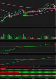
- Trend Reversal/Take Profit – If over the 0 line on the @Slippage indicator and 1 or 2 of the indicators turns red, all @BonBon indicators still green
- Sell - If over the 0 line on the @Slippage indicator and both of the indicators turn red, and @BonBon indicator starts turning blue/red on the 5-minute MTF bubbles. It could also be when only the lower MTF bubbles turn blue/red, but @Slippage indicators are still green.
- Strong Sell –If over the 0 line on the @Slippage indicator, and then it touches and/or dips below the 0 line on the @Slippage indicator.
- Also, Strong Sell - if any buy signal happens below the 0 line on the @Slippage indicator, and then the slippage indicators turn red again.
So, as you can see, there are many ways a buy or sell trigger can be generated with these indicators, which I believe is a good thing because you can manage your risk with the varying degrees of buys and sells along with different timeframes. I’m sure there are many more scenarios that could constitute a buy/sell signal, but these are the types of buys and sells I’ve identified as patterns so far. There could also be many more factors put into play by utilizing the moving averages to make better buy/sell decisions (ex. maybe only take trades and give buy signals above the 200-day moving avg etc.?), Fibonacci levels, last high, last low’s and whatever you guys think might help make a better trade in tandem with the two main indicators, all while keeping the chart clean, easy to read and easy to react to. Or maybe incorporate those things into risk levels that will give a signal based on whether the price is above or below these moving averages etc. Everything and anything is fair game so long as it gives you one clean view of the chart and lets you know what kind of trade you could potentially be getting into risk-wise.
Considerations-
Repainting – I believe that @Slippage indicator with the ladders (not smoothed) repaints, so does the @BonBon MTF indicator, so what could seem like a good trade and holding pattern one second could be a very different scenario if you’re dealing with a stock that has relatively high volume and volatile swings that day.
If anyone here can create @Bonbon’s lower MTF indicator without the repainting (if possible), that would help make for more solid buy/sell entry/exit points and make looking at past data more reliable to determine proper entry/exit points.
A case in point would be this chart below—high relative volume for SGLB on 3/15/2021 due to news catalyst. Buy signal happens at around 2:30 pm, and all is looking steady with a nice bump up in price around 2:43 pm as it crosses the @Slippage 0 line…all is looking good, all green indicators until the price immediately drops by 50 cents 2:54 pm and then turns the top @Slippage indicator red very far back behind till about 2:50 pm as well as turning the @BonBon indicator light blue then red starting at 2:50 pm as well (Repaint)…Smoothed @Slippage indicator stays true to the past few minutes and does not repaint. Because the drop happens almost instantaneously, the indicator gave no signs that this was going to happen…because the stock was so high volume, the only things you could have done to get out of that in time was to A) set a stop/trailing stop, or B) say to yourself that you don’t like two red candles in a row…C) Don’t trade highly volatile stocks with high relative volume after a certain hour in the day. I’ve replayed the moment OnDemand multiple times, and there’s nothing I could have done to avoid that because it happened in less than a second.
Smoothed Candles? – I love the look and simplicity of smoothed candles of the same color to indicate buy/sell trends on the chart. However, the biggest drawbacks for me on @BonBon’s upper chart with the smoothed candles is that the price is based on Heikin Ashi candles which don’t reflect the true current price, and most times seem to offer entries and exits that are too late if you’re only relying on the chart and no other indicators to make your buy/sell decisions (She mentions this as well in her post). If there is a way to make everything look smoothed, whether it is candles or a line while reflecting the true price, I’m all for whatever will make it easier to make the right choice at the right time, whether it’s buying, selling, or continuing to hold your position. As long as we’re always dealing with buy/sell triggers & labels based on actual real-time prices, candle look is not important, only for looks really.
Triggers – Would Buy/Sell labels be confirmed on the next candle but start showing up in the current candle whenever conditions are met? Repainting throws a wrench into this part.
Timeframes – ideally, this would work on any timeframe you wish to trade on, but if that is not possible, maybe go in between 1minute to 1day and intervals for the candles? So that means all indicators, scanners, and watchlists would have to function correctly on all these timeframes.
Scanners & Watchlists – Once a solid strategy is made and backtests successfully, scanners should be made to reflect all buy/sell status variations per time frame. This way, anyone can choose to trade risk levels they are comfortable within the time frames they are comfortable trading in. For example, if you only want to trade buys and strong buys on a 5-minute chart, you’ll only see those stocks that fit that criteria, or if you want to see the range of buy/sell statuses, that would be possible too. You could scan for all stocks or just ones from any segmented watchlist in your TOS. Any other creativity or items to add to the scanner’s reliability, efficacy and simplicity would be amazing to add. Also, maybe scanners for trampoline setups (Moxie) as well per timeframe. @BonBon has a great watchlist for her indicators. Something similar with all of the data points of this idea would be awesome to present all opportunities available during the entire trading day, which is what I envision.
Example scanner for @BonBon lower indicator
Example scanner for @Slippage indicators
More examples:
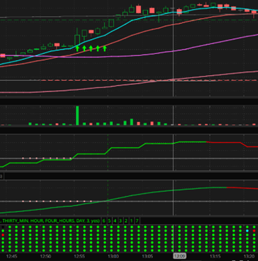
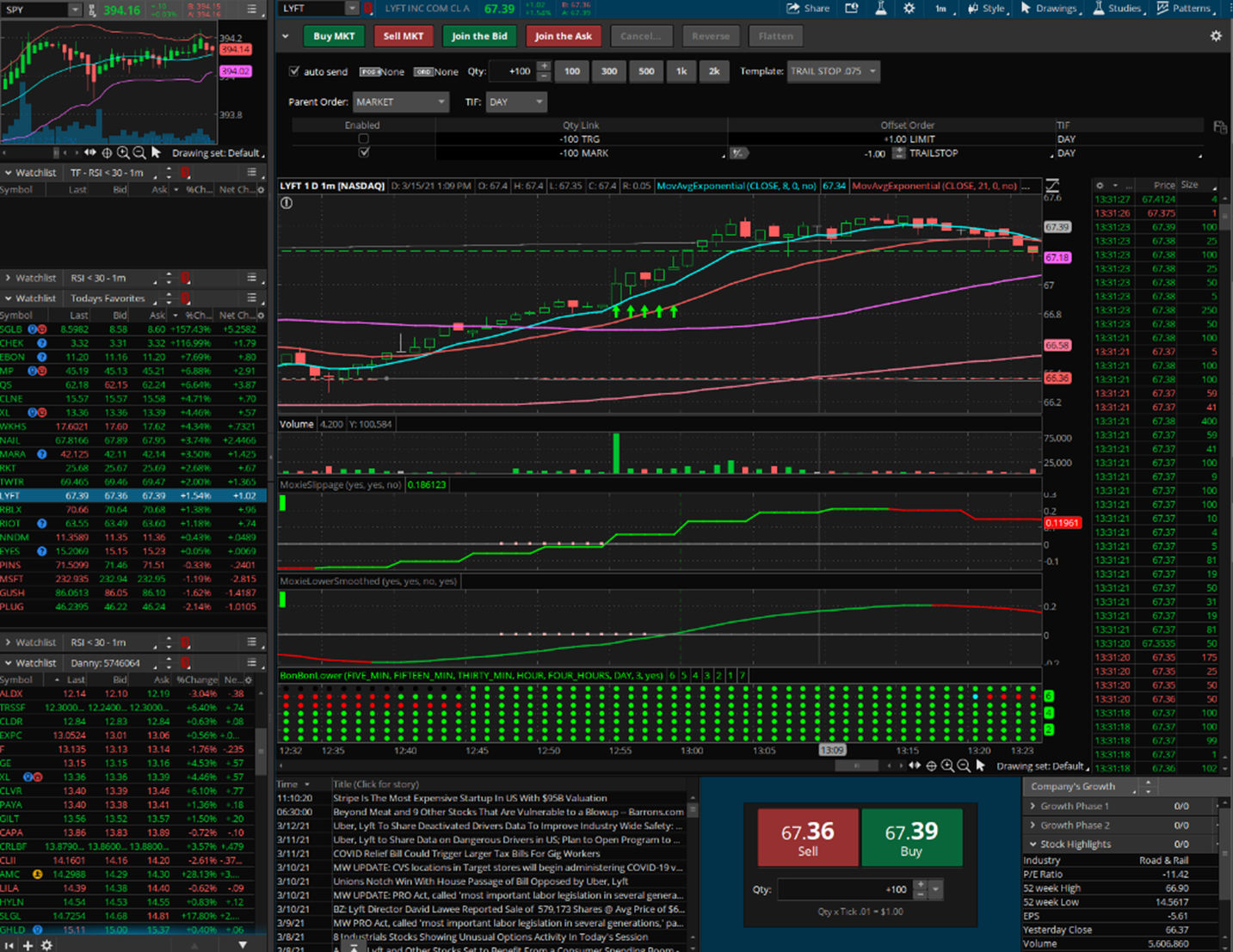
LYFT 3/15/2021 –
- 12:34 pm: Start watching because the 1st @Slippage indicator turned green
- 12:39 pm: Trend Reversal/Cautious Buy Signal -The 2nd @Slippage indicator is green but under the 0 line
- 12:45 pm: Buy Signal – Both @Slippage indicators are green, and all @BonBon MTF bubbles are green and under the 0 @Slippage line.
- 12:55 pm: Strong Buy Signal – Both @Slippage indicators are green, and all @BonBon MTF bubbles are green and over the 0 @Slippage line.
- 1:15 pm: Trend Reversal/Take Profit Signal – 1st @Slippage indicator turns red (Not 100% sure if this was a repaint, in that case, the 1st take profit signal was probably at 1:18 pm)
- 1:18 pm: 2nd Trend Reversal/Take Profit Signal – 2nd @Slippage indicator turns red
- 1:20-121pm: Sell Signal – Both @Slippage signals are red, and @BonBon 5-minute bubbles turn blue then red.
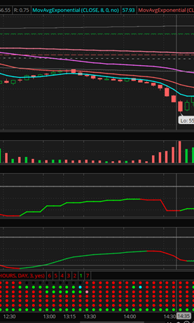
QS - 3/16/2021 –
- On a 5-minute chart, riding out the green would not make sense in this case. This would have been a cautious buy to begin with at around 12:45 pm because it is under the 0 line and MTF dots are not all green at the entry. The key, in this case, would be to get out asap when the 5-minute MTF bubble turned light blue/red. That shows the intricacies that must be accounted for when in different time frames and different scenarios. Maybe because we are in the 5-minute time frame, you need to always listen to the 5-minute TMF bubbles over the green trend lines? Maybe that is the case for whatever time frame you are trading in?
In conclusion, I hope I have demonstrated the framework of a winning system. I’m sure I’m probably missing a few nuts and bolts here and there, but the framework is solid, in my view. I believe that the combination of on-chart buy/sell signals/labels and the right scanners/watchlists to find the right opportunities during the trading day can prove to be a profitable system that will leave little to the user besides deciding how much risk they can handle per trade. I would be eternally grateful for your collaboration in making a good system great and easier to implement.
If you have any questions I'll do my best to help elaborate wherever I can...
Appreciate your brains and talent. I hope this leads to something we can all be proud of and use. Cheers!
Last edited:
