Several years back, I saw a video where someone noted that when the market is bullish, it typically closes higher than it opens. After some thinking, I decided to plot moving averages of the open and closing price on the same chart. I played around with a couple of different moving averages, eventually settling on the 8 and 21 ema. I further refined it by calculating the difference between the two moving averages and making it a histogram.
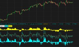
Below is what the chart looks like The blue line is the exponential moving average of the close, the red line is the moving average of the open. The solid lines are based on the 8 ema, the dashed lines are based on the 21 ema.
The first histogram below the curves is the difference between the open and closing price of the 8 ema, the bottom histogram uses the 21 ema.
You can easily scan for the crossing of the open vs close for either moving average. I use it mostly for confirmation that a trend is changing. I think it could be useful to imbed this as part of another indicator to confirm trend changes.
I also attached a screen shot showing how I create the moving average curves.
Code:
# This code calculates the difference between two exponential moving averages.
# One moving average is the moving average of the opening price.
# The second moving average is the moving average of the closing price.
# It is bullish when the price closes consistently higher than the open.
# A scan can be easily built to find stocks that transition from negative
# differential to positive differential.

declare lower;

input price1 = close;
input price2 = open;
input length = 8;
input displace = 0;
input showBreakoutSignals = no;

def AvgExp1 = ExpAverage(price1[-displace], length);
def AvgExp2 = ExpAverage(price2[-displace], length);
plot AvgExpdiff = AvgExp1 - AvgExp2;

AvgExpdiff.SetDefaultColor(GetColor(5));
AvgExpdiff.SetPaintingStrategy(PaintingStrategy.HISTOGRAM);
AvgExpdiff.SetLineWeight(3);
AvgExpdiff.DefineColor("Positive and Up", Color.GREEN);
AvgExpdiff.DefineColor("Positive and Down", Color.DARK_GREEN);
AvgExpdiff.DefineColor("Negative and Down", Color.RED);
AvgExpdiff.DefineColor("Negative and Up", Color.DARK_RED);
AvgExpdiff.AssignValueColor(if AvgExpdiff >= 0 then if AvgExpdiff > AvgExpdiff[1] then AvgExpdiff.color("Positive and Up") else AvgExpdiff.color("Positive and Down") else if AvgExpdiff < AvgExpdiff[1] then AvgExpdiff.color("Negative and Down") else AvgExpdiff.color("Negative and Up"));
plot ReferenceLine = 0;
# plot UpSignal = price crosses above AvgExp;
# plot DownSignal = price crosses below AvgExp;
# UpSignal.SetHiding(!showBreakoutSignals);
# DownSignal.SetHiding(!showBreakoutSignals);

# AvgExp.SetDefaultColor(GetColor(1));
# UpSignal.SetDefaultColor(Color.UPTICK);
# UpSignal.SetPaintingStrategy(PaintingStrategy.BOOLEAN_ARROW_UP);
# DownSignal.SetDefaultColor(Color.DOWNTICK);
# DownSignal.SetPaintingStrategy(PaintingStrategy.BOOLEAN_ARROW_DOWN);
Last edited by a moderator: