
mod note:
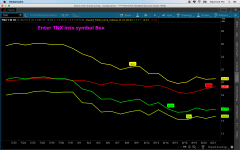
This script gives you a clean, at‑a‑glance read of the yield curve by plotting the 30‑yr, 10‑yr, 5‑yr, and 3‑month rates directly in one lower panel. Each maturity is color‑coded and labeled so you instantly see:
Most traders only look at TNX or a single spread. This gives you the full curve structure in real time, with no interpretation lag and no need to calculate spreads manually. It’s a behavioral cue engine: when the short end rips above the long end, you see it instantly; when the long end lifts, you see duration demand shift immediately.
Bottom line:
This script turns the yield curve into a visual macro indicator you can read in one glance—no math, no guesswork, no switching charts. It keeps you aligned with the macro regime that drives equity momentum, liquidity, and volatility.
This indicator was shared by Ken Rose of TD Ameritrade to help you build your own Yield curve chart in ThinkorSwim. Be sure to visit the ToS' settings page and set your chart type to Line.

This script gives you a clean, at‑a‑glance read of the yield curve by plotting the 30‑yr, 10‑yr, 5‑yr, and 3‑month rates directly in one lower panel. Each maturity is color‑coded and labeled so you instantly see:
» Curve shape (steepening, flattening, or inversion)
» Where stress is building (short end spiking vs long end anchored)
» Risk‑on / risk‑off tone (steepening = expansionary, inversion = defensive)
» Macro regime shifts without needing a separate dashboard
Most traders only look at TNX or a single spread. This gives you the full curve structure in real time, with no interpretation lag and no need to calculate spreads manually. It’s a behavioral cue engine: when the short end rips above the long end, you see it instantly; when the long end lifts, you see duration demand shift immediately.
Bottom line:
This script turns the yield curve into a visual macro indicator you can read in one glance—no math, no guesswork, no switching charts. It keeps you aligned with the macro regime that drives equity momentum, liquidity, and volatility.
This indicator was shared by Ken Rose of TD Ameritrade to help you build your own Yield curve chart in ThinkorSwim. Be sure to visit the ToS' settings page and set your chart type to Line.
thinkScript Code
Code:
#TWITTER: @KROSE_TDA
#Yield curve two indexes
#declare lower;
def barn = if !IsNaN(close) then BarNumber() else Double.NEGATIVE_INFINITY;
input line_Weight = 3;
#input color = ("Light_Background", "Dark_Bacjkground");
Input Bubble_Offset = 12;
################################################
plot ThirtyYear = close("TYX");
thirtyYear.AssignValueColor(color.YELLOW);
thirtyYear.SetLineWeight(line_Weight);
addChartBubble  (barNumber()==highestAll(barn)-bubble_offset,thirtyYear,"30Yr",color.yellow);
#################################################
plot TenYear = close("TNX");
tenYear.AssignValueColor(color.GREEN);
tenYear.SetLineWeight(line_Weight);
addChartBubble  (barNumber()==highestAll(barn)-(bubble_offset -4),tenyear,"10Yr",color.GREEN);
########################################
plot FiveYear = close("FVX");
FiveYear.AssignValueColor(color.LIME);
FiveYear.SetLineWeight(line_Weight);
addChartBubble  (barNumber()==highestAll(barn)-(bubble_offset -6),fiveyear,"5Yr",color.LIME);
########################################
plot Threemonth = close("IRX");
threemonth.AssignValueColor(color.RED);
threemonth.SetLineWeight(line_Weight);
addChartBubble  (barNumber()==highestAll(barn)-(bubble_offset -8),threemonth,"3Mo",color.RED);
Shareable Link
https://tos.mx/EYw42xAttachments
Last edited by a moderator: