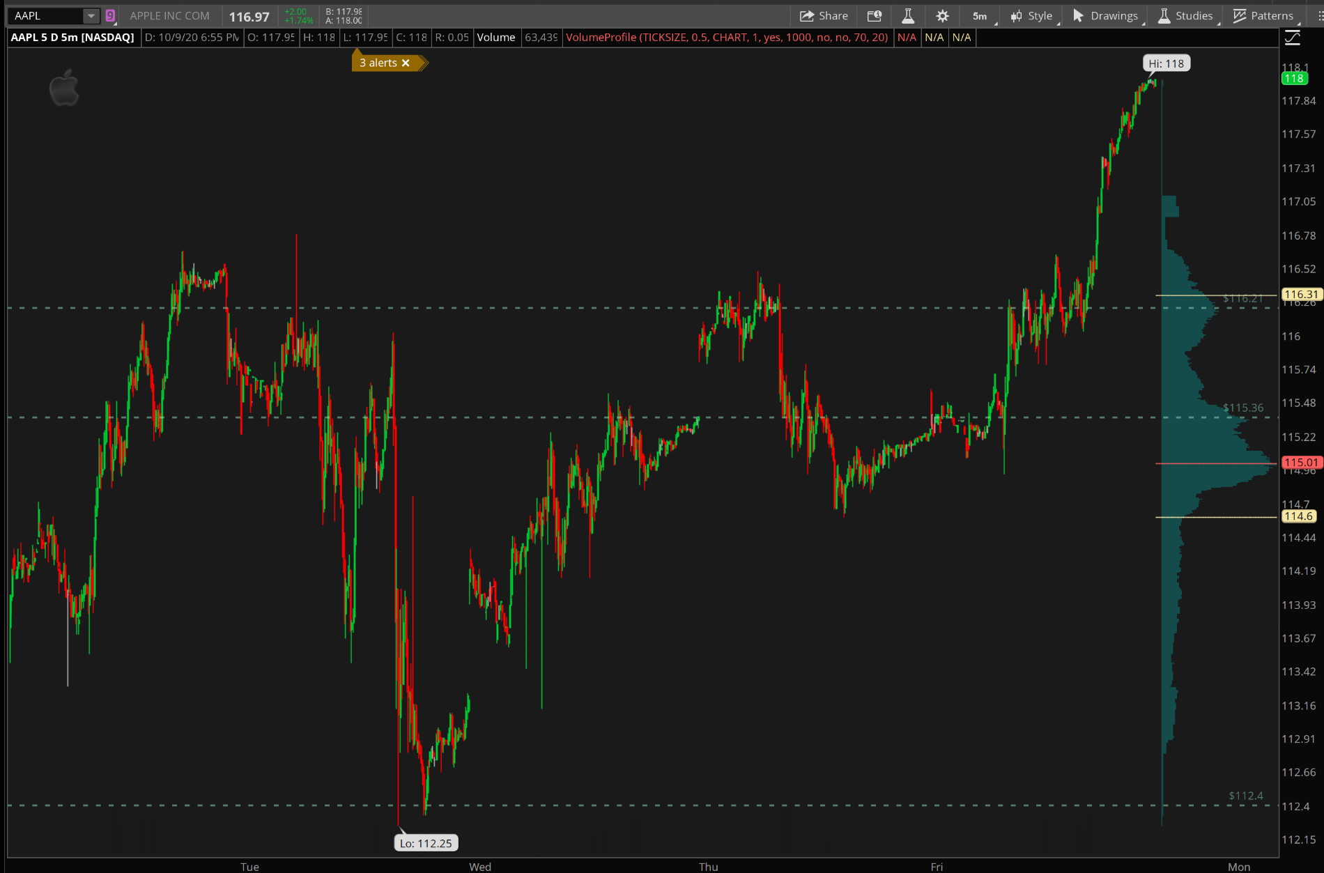
I am trying to add volume profile into the expansion area like in the OP and have set time axis to expand 10 bars to the right. But after applying the VP study to my chart, it looks like this and VP takes up more than half the chart. What am i missing here?
The difference is the OP chart has 5 days of 5m data without extended hours and zoomed all the way out. There's a lot more candles on the screen which makes VP look small in comparison.
There was a time when I wanted to do the same thing I think you're aiming for. What I ended up doing instead is disabling On Expansion and changing the colors and opacity to make this study less ugly and obtrusive and obstructive and -- Christ could they have made the defaults any worse? -- when overlapping price.
Below you can see my white/gray version which is what I primarily use. That's the only study on this chart. The white lines are VA top/bottom and POC. On some charts I blacked out the horizontal volume bars and made the 3 white lines dark gray so VP is very subtle on the chart. It doesn't stand out at all, less visual noise, but you can see it when you're looking for it. Obviously, different candle colors would stand out more on this chart. I don't usually use these colors together.