Thinkorswim Chart Study and Thinkscript Plot Hierarchy
Chart study hierarchy within Thinkorswim is one concept that I haven’t found any information on so I had to do some experimenting in order to determine the dirty details… During my research I discovered that hierarchy differs between the chart study panels and thinkscript code itself… I’ll cover the nuances of each here in an effort to shed light on the subject…
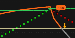
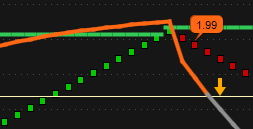
Let’s go over the upper chart panel hierarchy first… Have you ever wanted one study to display on top of another rather than vise versa…??? For example, I wanted my Day_Highs_and_Lows indicator lines to be in the background with my chart panel RSI to be in front of most other studies… What I discovered is that the closer to the top of the list a study is, the further in the background that chart layer paints and the closer to the bottom of the study stack a study is, the closer to the foreground that chart layer paints… Either using the up and down arrows in the study controls on the right of the panel or dragging and dropping into the preferred hierarchy achieves this task… The same goes for some but not all studies in the lower chart panel when stacked in a single lower section… The figures below illustrate the difference in stack painting order within chart study panels...
RSI Indicator Under Day_Highs_and_Lows Indicator

RSI Indicator Over Day_Highs_and_Lows Indicator

Now onto plot hierarchy within thinkscript code… The hierarchy is the exact opposite for study and strategy scripts where plots are painted… If the script has more than one plot then hierarchy comes into play… For the example here we’ll cover the Waddah_Attar_Explosion study… In the default code I use the ex and xLine plots were painting behind the histogram which wasn’t the most ideal location for such important components… Within script code the foreground plots need to be at the top of the plot stack and background plots should be at the bottom of the plot stack… By moving the ex and xLine plots to the top of the stack they now paint on top of the histogram… I have my xLine line painting on top of ex to make it easier to see when ex has dipped below xLine which indicates a no trade scenario when settings are correctly calibrated… To accomplish all of this I moved the xLine plot to the top of the stack with xLine directly below ex with the histogram plots at the bottom of the stack… The figures below illustrate the difference in stack painting order within chart study scripts...
ex and xLine Behind Histogram

ex and xLine Over Histogram

Edited to add: The image above show a No-Trade condition where the white ex line has dipped behind and below the blue xLine, even if the a green bar painted above the lines it would still be a No-Trade condition unless multiple other indicators signal otherwise... And without even seeing the chart I can tell that the instrument is in a stretch of chop, probably downtrend...
I hope someone will find this information helpful… I am forever tweaking thinkscript code and like seeing data plotted and painted in a manner that suits my preferences best… Data is only worthwhile if we can interpret it rapidly and accurately...
Chart study hierarchy within Thinkorswim is one concept that I haven’t found any information on so I had to do some experimenting in order to determine the dirty details… During my research I discovered that hierarchy differs between the chart study panels and thinkscript code itself… I’ll cover the nuances of each here in an effort to shed light on the subject…
Let’s go over the upper chart panel hierarchy first… Have you ever wanted one study to display on top of another rather than vise versa…??? For example, I wanted my Day_Highs_and_Lows indicator lines to be in the background with my chart panel RSI to be in front of most other studies… What I discovered is that the closer to the top of the list a study is, the further in the background that chart layer paints and the closer to the bottom of the study stack a study is, the closer to the foreground that chart layer paints… Either using the up and down arrows in the study controls on the right of the panel or dragging and dropping into the preferred hierarchy achieves this task… The same goes for some but not all studies in the lower chart panel when stacked in a single lower section… The figures below illustrate the difference in stack painting order within chart study panels...
RSI Indicator Under Day_Highs_and_Lows Indicator
RSI Indicator Over Day_Highs_and_Lows Indicator
Now onto plot hierarchy within thinkscript code… The hierarchy is the exact opposite for study and strategy scripts where plots are painted… If the script has more than one plot then hierarchy comes into play… For the example here we’ll cover the Waddah_Attar_Explosion study… In the default code I use the ex and xLine plots were painting behind the histogram which wasn’t the most ideal location for such important components… Within script code the foreground plots need to be at the top of the plot stack and background plots should be at the bottom of the plot stack… By moving the ex and xLine plots to the top of the stack they now paint on top of the histogram… I have my xLine line painting on top of ex to make it easier to see when ex has dipped below xLine which indicates a no trade scenario when settings are correctly calibrated… To accomplish all of this I moved the xLine plot to the top of the stack with xLine directly below ex with the histogram plots at the bottom of the stack… The figures below illustrate the difference in stack painting order within chart study scripts...
ex and xLine Behind Histogram
ex and xLine Over Histogram
Edited to add: The image above show a No-Trade condition where the white ex line has dipped behind and below the blue xLine, even if the a green bar painted above the lines it would still be a No-Trade condition unless multiple other indicators signal otherwise... And without even seeing the chart I can tell that the instrument is in a stretch of chop, probably downtrend...
I hope someone will find this information helpful… I am forever tweaking thinkscript code and like seeing data plotted and painted in a manner that suits my preferences best… Data is only worthwhile if we can interpret it rapidly and accurately...
Last edited:
