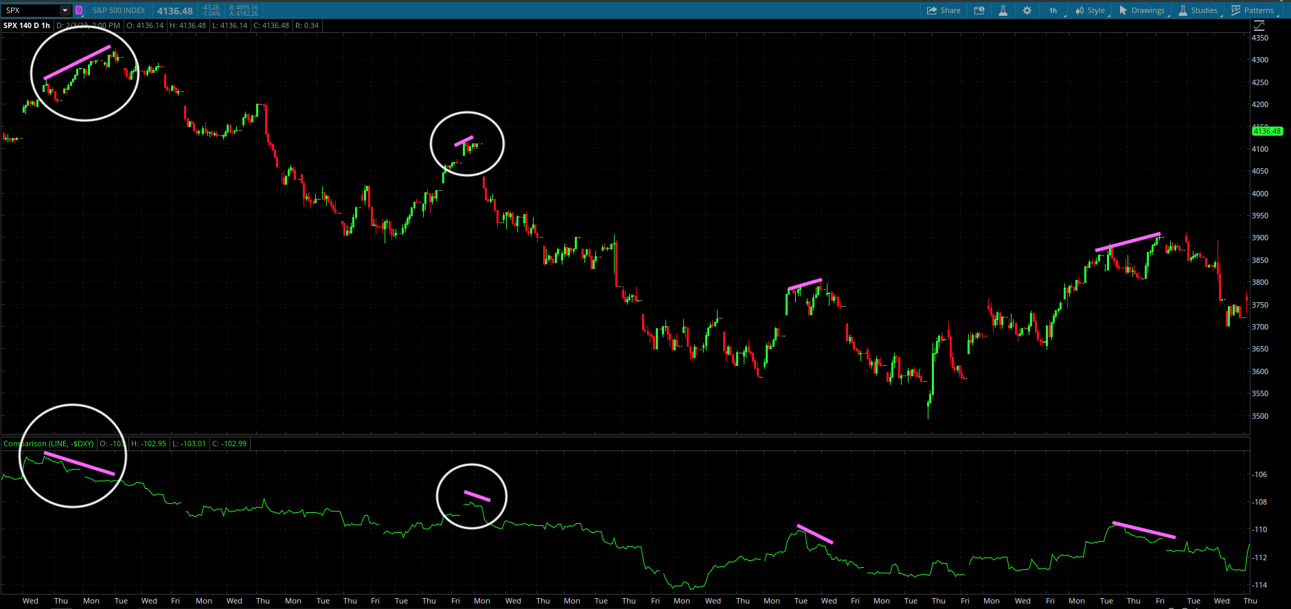
$DXY is something to be aware of in terms of spotting divergences that act as a selloff warning - especially when greed/euphoria start to take hold. Simply noticing $DXY + stocks up at the same time isn't enough. Using an inverted $DXY comparison line will give you better visuals. It can be used on all major indexes - S&P, Dow, Nasdaq etc., but I recommend using it on SPX for overall/general market direction; can be used on the ETF's that mirror the indexes tick-for-tick like SPY etc.. Don't use it on individual stocks. Works best on 1H & 4H timeframes, but I use it on 1H. It should also be noted, that you must have the extended hours trading session turned on for the instrument you are comparing to $DXY. $DXY will have gaps if you try to use it on regular trading session.
Notice the two divergences I have highlighted with the white circles. You will see the first one had a longer duration before the selling started, while the second one was much shorter & less noticeable. Whether you use it to enter a trade is up to you, but at the very least, it provides a good warning signal that a decline is soon around the corner. Inverted $DXY divergences don't happen often, but they always have a big impact when they do in fact occur.
 [/IMG]
Notice the two divergences I have highlighted with the white circles. You will see the first one had a longer duration before the selling started, while the second one was much shorter & less noticeable. Whether you use it to enter a trade is up to you, but at the very least, it provides a good warning signal that a decline is soon around the corner. Inverted $DXY divergences don't happen often, but they always have a big impact when they do in fact occur.
