
mbarcala
Active member
Here another version of RedK VADER - RedK Volume-Accelerated Directional Energy from tradingView converted to TOS, Enjoy!
Original Link: https://www.tradingview.com/script/...elerated-Directional-Energy-Ratio-RedK-VADER/
The Volume-Accelerated Directional Energy Ratio (VADER) makes use of price moves (displacement) and the associated volume (effort) to estimate the positive buying and negative selling energy behind the scenes, enabling traders to read the market action in more details and adjust their trading decisions accordingly.
Lets walk though it as we avoid getting too technical:
Large price moves that are associated with large volume means buyers (if the move is up) or sellers (when the move is down) are serious and are "in control" of the action
On the other hand, when the price moves are small but with large volume, it means there's a fight, or more of a balance of energy, between buying and selling.
Also when large price moves are associated with relatively limited volume, there's a lack of "energy" from either buyers or sellers - and moves likes these are usually short-lived.
The analogy with VADER, is that we look at price moves (change of close between 2 bars) as the displacement (or action result) and the associated volume as the "effort" behind this action. Combining these 2 values together, the displacement and the effort, gives us a representation or a proxy of the underlying energy (in a specific direction).
when both values (displacement and effort) are high, then the resulting energy is high - and if one of these values are low, the resulting energy is low.
we then take an average of that relative energy in each direction (positive = buying - negative = selling) and calculate the net energy.
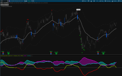
VADER Plots
1- the blue line with crosses represents the positive energy or the buying strength
2- the orange line with circles represents the negative energy or the selling strength
3- the thick Green / Red main line plot represents the net energy and generally the main signal to be looking out for is when that line crosses 0 up or down - but i find it also very valuable to keep an eye on the individual energy lines as they sometimes tell a story like we see in the chart below.
Upper Indicator here: https://usethinkscript.com/threads/break-keltner-bands-bkb-for-thinkorswim.11220/
photo
13552[/ATTACH]']

script
Original Link: https://www.tradingview.com/script/...elerated-Directional-Energy-Ratio-RedK-VADER/
The Volume-Accelerated Directional Energy Ratio (VADER) makes use of price moves (displacement) and the associated volume (effort) to estimate the positive buying and negative selling energy behind the scenes, enabling traders to read the market action in more details and adjust their trading decisions accordingly.
Lets walk though it as we avoid getting too technical:
Large price moves that are associated with large volume means buyers (if the move is up) or sellers (when the move is down) are serious and are "in control" of the action
On the other hand, when the price moves are small but with large volume, it means there's a fight, or more of a balance of energy, between buying and selling.
Also when large price moves are associated with relatively limited volume, there's a lack of "energy" from either buyers or sellers - and moves likes these are usually short-lived.
The analogy with VADER, is that we look at price moves (change of close between 2 bars) as the displacement (or action result) and the associated volume as the "effort" behind this action. Combining these 2 values together, the displacement and the effort, gives us a representation or a proxy of the underlying energy (in a specific direction).
when both values (displacement and effort) are high, then the resulting energy is high - and if one of these values are low, the resulting energy is low.
we then take an average of that relative energy in each direction (positive = buying - negative = selling) and calculate the net energy.
VADER Plots
1- the blue line with crosses represents the positive energy or the buying strength
2- the orange line with circles represents the negative energy or the selling strength
3- the thick Green / Red main line plot represents the net energy and generally the main signal to be looking out for is when that line crosses 0 up or down - but i find it also very valuable to keep an eye on the individual energy lines as they sometimes tell a story like we see in the chart below.
Upper Indicator here: https://usethinkscript.com/threads/break-keltner-bands-bkb-for-thinkorswim.11220/
photo
13552[/ATTACH]']
script
Code:
# This source code is subject to the terms of the Mozilla Public License 2.0 at https://mozilla.org/MPL/2.0/
# RedKTrader - version=5
#Original link: https://www.tradingview.com/script/7s0lx2Bw-RedK-Volume-Accelerated-Directional-Energy-Ratio-RedK-VADER/
#RedK VADER - RedK Volume-Accelerated Directional Energy Ratio converted to TOS by mbarcala

declare lower;

input length = 20;
input DER_avg = 5;
input smooth = 3;
input v_calc = {default Relative, Full, None};
input vlookbk = 20;

def min_value = lowest(volume, vlookbk);
def max_value = highest(volume, vlookbk);

def vola;
switch(v_calc) {
    case Relative:
        vola = 100 * (volume - lowest(min_value, vlookbk)) / (highest(max_value, vlookbk) - lowest(min_value, vlookbk));
    case Full:
        vola = volume;
    case None:
        vola = 1;
}

def R = (highest(high, 2) - lowest(low, 2)) / 2;
def sr = (close - close[1]) / R;
def rsr = max(min(sr, 1), -1);
def c = rsr * vola;
def c_plus = max(c, 0);
def c_minus = -min(c, 0);
def dem = wma(c_plus, length)/ wma(vola, length);
def sup = wma(c_minus, length)/ wma(vola, length);
def adp = 100 * wma(dem, DER_avg);
def asp = 100 * wma(sup, DER_avg);
def anp = adp - asp;
def anp_s = wma(anp, smooth);

plot Signal = anp_s;
Signal.AssignValueColor(if anp_s >= 0 then Color.LIME else Color.RED);
Signal.SetLineWeight(3);


plot Bull = asp;
Bull.SetDefaultColor(Color.MAGENTA);
Bull.SetPaintingStrategy(PaintingStrategy.LINE_VS_POINTS);

plot Bear = adp;
Bear.SetDefaultColor(Color.CYAN);
Bear.SetPaintingStrategy(PaintingStrategy.LINE_VS_POINTS);

AddCloud(Bear, Bull, Color.CYAN, Color.MAGENTA);

plot cline = 0;
cline.SetDefaultColor(Color.GRAY);
Attachments
Last edited by a moderator: