Multi-TimeFrame Candles Overlay for ThinkOrSwim

Townsend

Active member
VIP
Here is the MTF candlestick indicator for ThinkorSwim. This indicator will overlay higher time frame candles onto your chart.

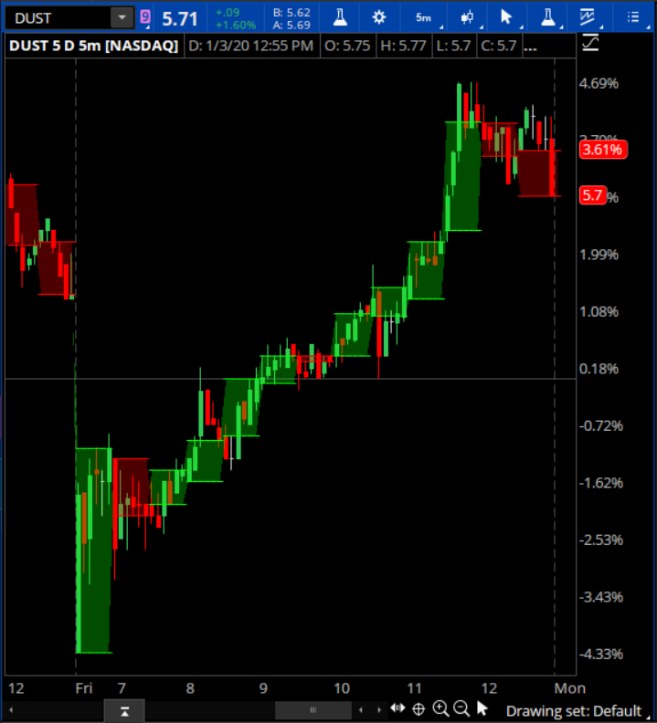
@Utajiri asked for this. It's pretty simple. Here is a 5 minute DUST chart (3x short gold & silver) with 30 minute boxes overlaid. These 30 minute boxes correspond to the 30 minute red/green and open/close candles.
WeMc2NB.png


Code:
input agg = AggregationPeriod.FOUR_HOURS;
plot o = open(period = agg);
plot c = close(period = agg);
o.AssignValueColor(if o > c then Color.Red else Color.Green);
o.SetPaintingStrategy(PaintingStrategy.HORIZONTAL);
c.AssignValueColor(if o > c then Color.Red else Color.Green);
c.SetPaintingStrategy(PaintingStrategy.HORIZONTAL);
AddCloud(c, o, Color.Green, Color.Red);

Edit: Link to most current version.
 
Last edited:

Join useThinkScript to post your question to a community of 21,000+ developers and traders.

@Townsend Excellent code, thank you. Please edit your code above with the following:
1 Name
2 Author and Revision #
3 Date Created
As shown below:
# LBR Three Ten Watchlist XaboveZ - XbelowZ
# By Markos in useThinkScript messing with code from Paris 12-22-2019
# 12.19.2019

@BenTen we need to remind all posters that this website needs proper citations for search and proper author credit.
 
Awesome stuff @Townsend -
Love it.
Can we introduce to this a horizontal line (within the space of the time frame), that represents the high (red) and the low (green) too?
 
Glad to see you liked this one. So... I've added some features:

** Label now displays which time frame is currently being overlaid.
** Added the ability to also display High and Low lines.
** Whether to display Open/Close and/or High/Low lines now user selectable.
** Also ability to make High/Low lines gray and less obtrusive.

Here's the updated code:
Code:
# Multi-Time-Frame Candle Overlay version 2.0
# 2020 Paul Townsend
# with code from UseThinkScript.com

input agg = AggregationPeriod.fifteen_min;
input OpenCloseLines = yes;
input HighLowLines = yes;
input HighLowGray = no;
addlabel(yes,"[" + agg/60000 + "]",color.white);

plot o = open(period = agg);
o.sethiding(!OpenCloseLines);
plot c = close(period = agg);
c.sethiding(!OpenCloseLines);
plot h = high(period = agg);
h.sethiding(!HighLowLines);
plot l = low(period = agg);
l.sethiding(!HighLowLines);

o.AssignValueColor(if o > c then Color.Red else Color.Green);
c.AssignValueColor(if o > c then Color.Red else Color.Green);
AddCloud(c, o, Color.Green, Color.Red);
h.AssignValueColor(if highlowgray then color.gray else if o > c then Color.Red else Color.Green);
l.AssignValueColor(if highlowgray then color.gray else if o > c then Color.Red else Color.Green);
#h.AssignValueColor(color.gray);
#l.AssignValueColor(color.gray);

o.SetPaintingStrategy(PaintingStrategy.HORIZONTAL);
c.SetPaintingStrategy(PaintingStrategy.HORIZONTAL);
h.SetPaintingStrategy(PaintingStrategy.HORIZONTAL);
l.SetPaintingStrategy(PaintingStrategy.HORIZONTAL);
 
Is it possible to make vertical lines in the middle as the wicks?
It's complicated, but possible. I think you'd have to set up 2 additional plots to contrive a single high/low line. To the best of my knowledge ThinkScript does not have the ability to draw partial vertical lines between 2 price points. And even if this was done, it probably wouldn't be that good.

For instance, I'm looking at a 5 minute candle chart, with my 15 minute overlay. Looks like the 15 minute overlay is draw at and ahead on the first 5 minute bar. A high/low line off the 15 min open/close lines could easy be confused with the center high/low line of the middle 5 minute candle. The way it is now, it's very easy to see how the 15 minute high and low encompass the high/low lines of the 5 minute candles.

Though... I think what dose need to be added is to make the open/close line a different color, and heavier, when they are equal.
 
Okay. Minor update. If open and close are equal, the line shows up as white instead of green.
I wanted to make it heavier, but found out this was not possible. Got the message:
Cannot access dynamic value for initialization of 'setlineweight'
Code:
# Multi-Time-Frame Candle Overlay version 2.1
# 2020 Paul Townsend
# with code from UseThinkScript.com

input agg = AggregationPeriod.fifteen_min;
input OpenCloseLines = yes;
input HighLowLines = yes;
input HighLowGray = no;
addlabel(yes,"[" + agg/60000 + "]",color.white);

plot o = open(period = agg);
o.sethiding(!OpenCloseLines);
plot c = close(period = agg);
c.sethiding(!OpenCloseLines);
plot h = high(period = agg);
h.sethiding(!HighLowLines);
plot l = low(period = agg);
l.sethiding(!HighLowLines);

o.AssignValueColor(if open==close then color.white else if o > c then Color.Red else Color.Green);
c.AssignValueColor(if open==close then color.white else if o > c then Color.Red else Color.Green);
AddCloud(c, o, Color.Green, Color.Red);
h.AssignValueColor(if highlowgray then color.gray else if o > c then Color.Red else Color.Green);
l.AssignValueColor(if highlowgray then color.gray else if o > c then Color.Red else Color.Green);
#h.AssignValueColor(color.gray);
#l.AssignValueColor(color.gray);

o.SetPaintingStrategy(PaintingStrategy.HORIZONTAL);
c.SetPaintingStrategy(PaintingStrategy.HORIZONTAL);
h.SetPaintingStrategy(PaintingStrategy.HORIZONTAL);
l.SetPaintingStrategy(PaintingStrategy.HORIZONTAL);
 
@Townsend

Great work so far. See this thread for hints on improving your indicator. Specifically, the outlines and wicks are drawn using
the undocumented AddChart() function in a non-standard way by plotting a bar chart at the opening and closing bar of the overlay candle body.

The AddChart() function uses the following format.

Ruby:
AddChart(high, low, open, close, {chart type}, {grow color}, {fall color}, {neutral color});

where the chart type can be:
    ChartType.AREA
    ChartType.BAR
    ChartType.CANDLE
    ChartType.CANDLE_TREND
    ChartType.EQUIVOLUME
    ChartType.HEIKEN_ASHI
    ChartType.LINE
growColor, fallColor, and neutralColor are supposed to set the colors for up, down, and doji candles. However, this function is no longer fully supported and the only color that seems to function anymore is growColor. I did a tutorial showing how to get around that limitation if you ever wanted to use this function and have the candles painted a different color.

For the bar chart (used to draw the outlines and the wicks) you'll want to assign OHLC values when you want the lines drawn then set them to Double.NAN for the bars you don't want any lines drawn.
 
Last edited by a moderator:
Great work so far. See this thread for hints on improving your indicator. Specifically, the outlines and wicks are drawn using
the undocumented AddChart() function in a non-standard way by plotting a bar chart at the opening and closing bar of the overlay candle body.

@RobertPayne Thanks for the info on the AddChart() function! Setting up the horizontal lines of the box was easy. And I understand that the vertical lines need to be drawn with a condition else double.nan. But I can't imagine how to determine the beginning bar of the Aggregation Period, and the end bar of the Aggregation Period, to properly draw the vertical lines of the box. And the middle of the Aggregation Period, to draw the high/low lines above and below the box. Do I need to convert the Aggregation Period to seconds and parse from there? Or is that the long way around?

Also on a related issue, you said:
So, the question is, how do you get the paint to stay within the boxes?
Hint: you will need to use more than one AddCloud() statement.

I've thought about this a lot, and still can't come up with what the conditional the AddCloud() statement is looking at.

Looked over at your website. Looks like you've already done all the hard work!
Any chance you could offer a discount code for UseThinkScript members?
Feel free to put an expiration date on the offer, if need be.
 
I can't imagine how to determine the beginning bar of the Aggregation Period, and the end bar of the Aggregation Period, to properly draw the vertical lines of the box. And the middle of the Aggregation Period, to draw the high/low lines above and below the box. Do I need to convert the Aggregation Period to seconds and parse from there? Or is that the long way around?

You are on the right track. You'll want to use the GetAggregation() function to determine the aggregation of the current chart. Then, use that value along with the aggregation of the chosen secondary time frame to determine how many candles / MTF overlay. From there, you should be able to work out which candle is the start / end of a given MTF period.

You need to use two AddCloud() functions--one for even MTF periods and one for odd.
 
Just tested this over the weekend. Very cool, nice job! One thing I noticed on /ES is that it doesn't paint the current candle if set on daily but it does if you set in on weekly.
 

Similar threads

Not the exact question you're looking for?

Start a new thread and receive assistance from our community.

87k+ Posts
469 Online
Create Post

Similar threads

Similar threads

The Market Trading Game Changer

Join 2,500+ subscribers inside the useThinkScript VIP Membership Club
  • Exclusive indicators
  • Proven strategies & setups
  • Private Discord community
  • ‘Buy The Dip’ signal alerts
  • Exclusive members-only content
  • Add-ons and resources
  • 1 full year of unlimited support

Frequently Asked Questions

What is useThinkScript?

useThinkScript is the #1 community of stock market investors using indicators and other tools to power their trading strategies. Traders of all skill levels use our forums to learn about scripting and indicators, help each other, and discover new ways to gain an edge in the markets.

How do I get started?

We get it. Our forum can be intimidating, if not overwhelming. With thousands of topics, tens of thousands of posts, our community has created an incredibly deep knowledge base for stock traders. No one can ever exhaust every resource provided on our site.

If you are new, or just looking for guidance, here are some helpful links to get you started.

What are the benefits of VIP Membership?
VIP members get exclusive access to these proven and tested premium indicators: Buy the Dip, Advanced Market Moves 2.0, Take Profit, and Volatility Trading Range. In addition, VIP members get access to over 50 VIP-only custom indicators, add-ons, and strategies, private VIP-only forums, private Discord channel to discuss trades and strategies in real-time, customer support, trade alerts, and much more. Learn all about VIP membership here.
How can I access the premium indicators?
To access the premium indicators, which are plug and play ready, sign up for VIP membership here.
Back
Top