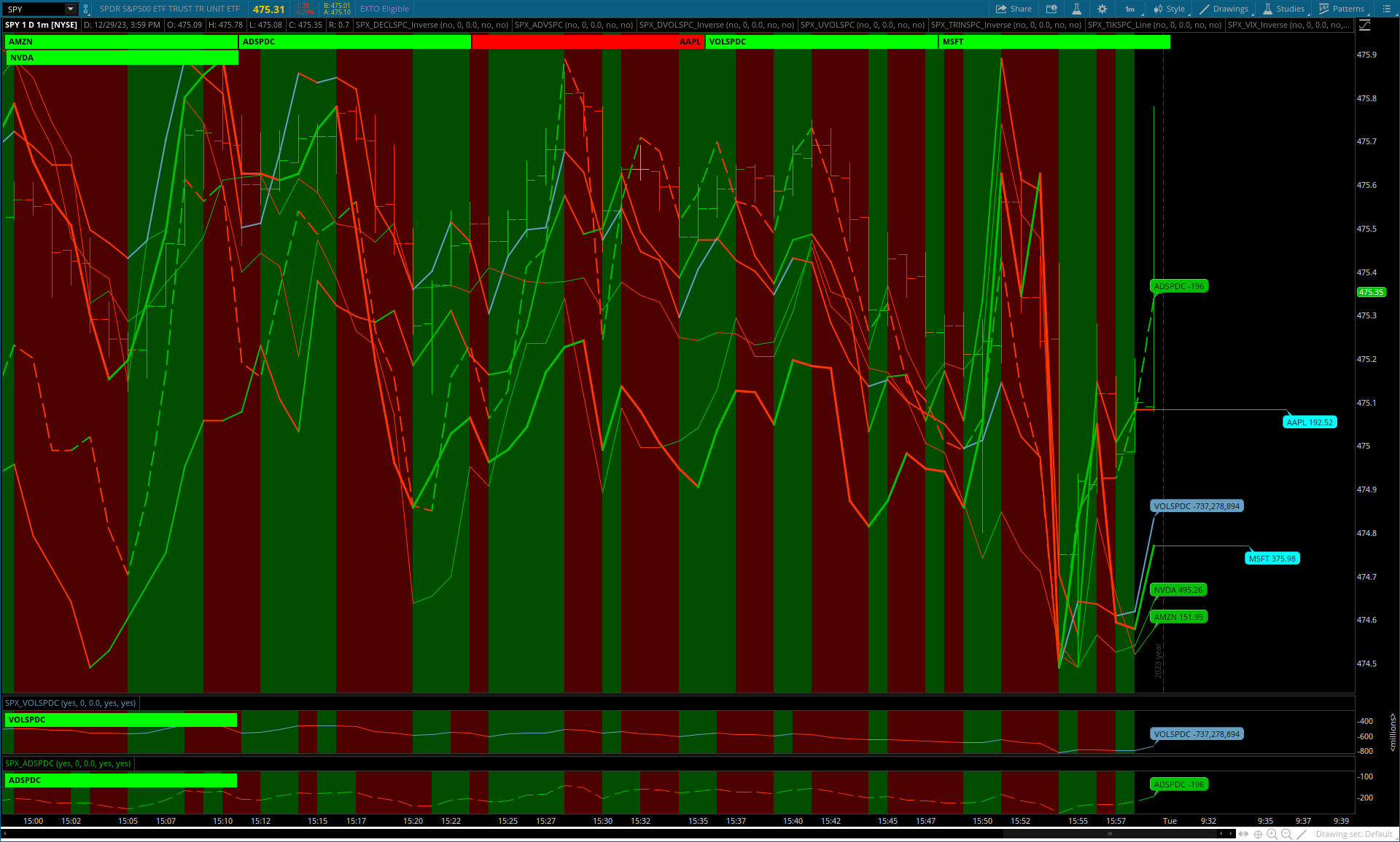
Summary: A visual dynamic comparing another symbol(s) with value on your main chart.
Each study has a Chart Bubble, Cloud, Label and Line with on/off display and each will change color: up = green, down = red.
The Lines act as reference lines with Chart Bubbles as absolute values.
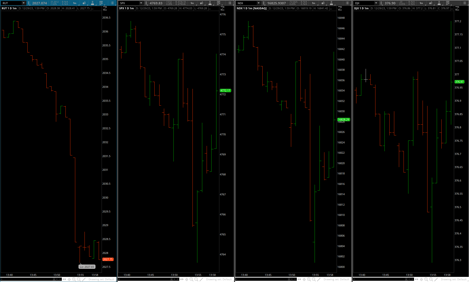
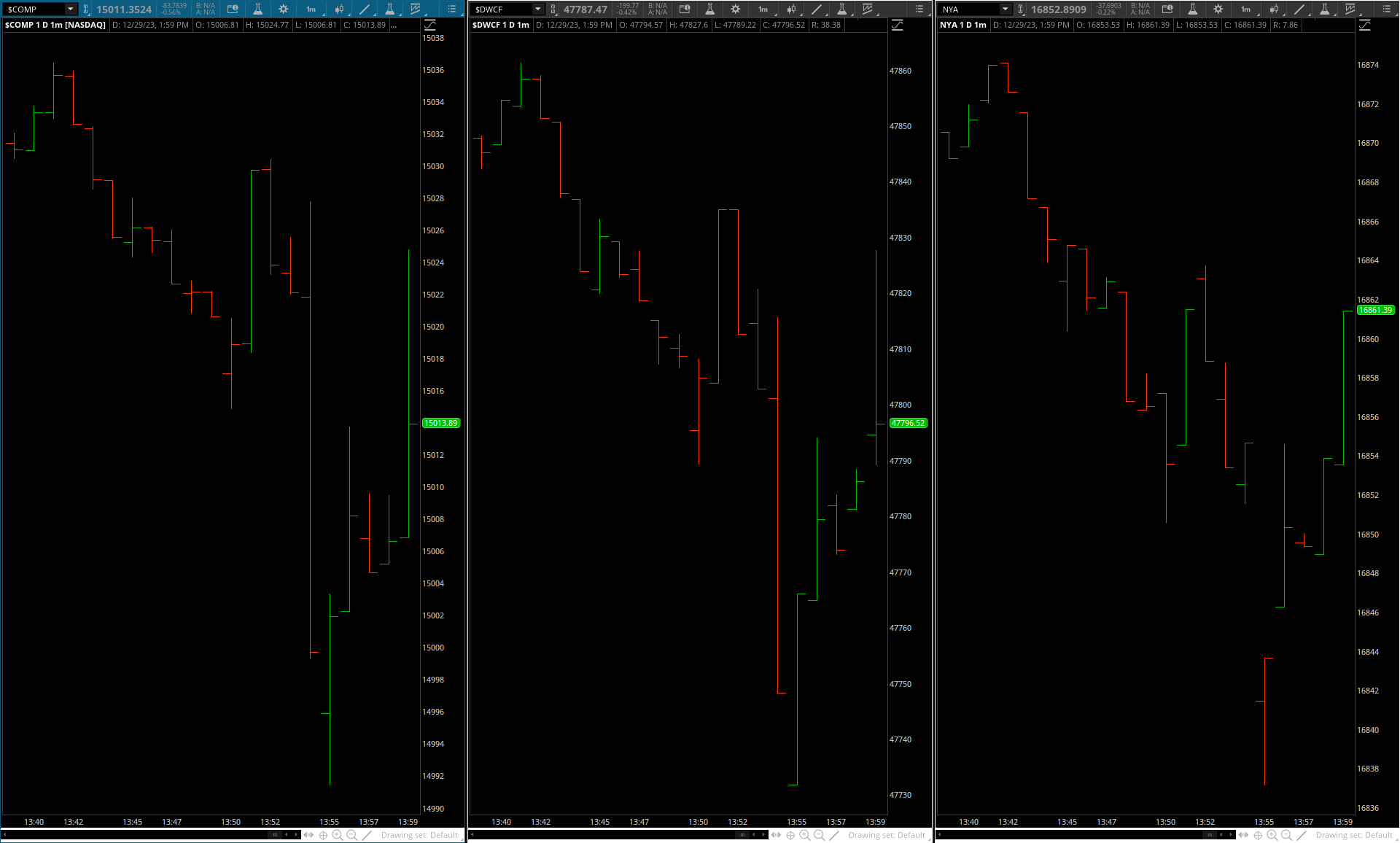
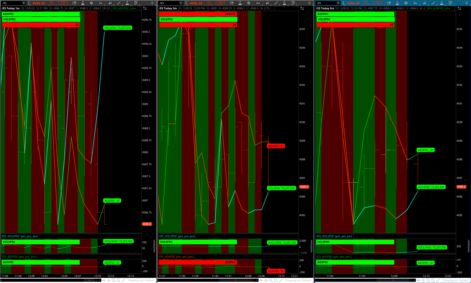
1min. | 3 min. | 5 min. time frames shown:
shared link: https://tos.mx/f0xTaFt
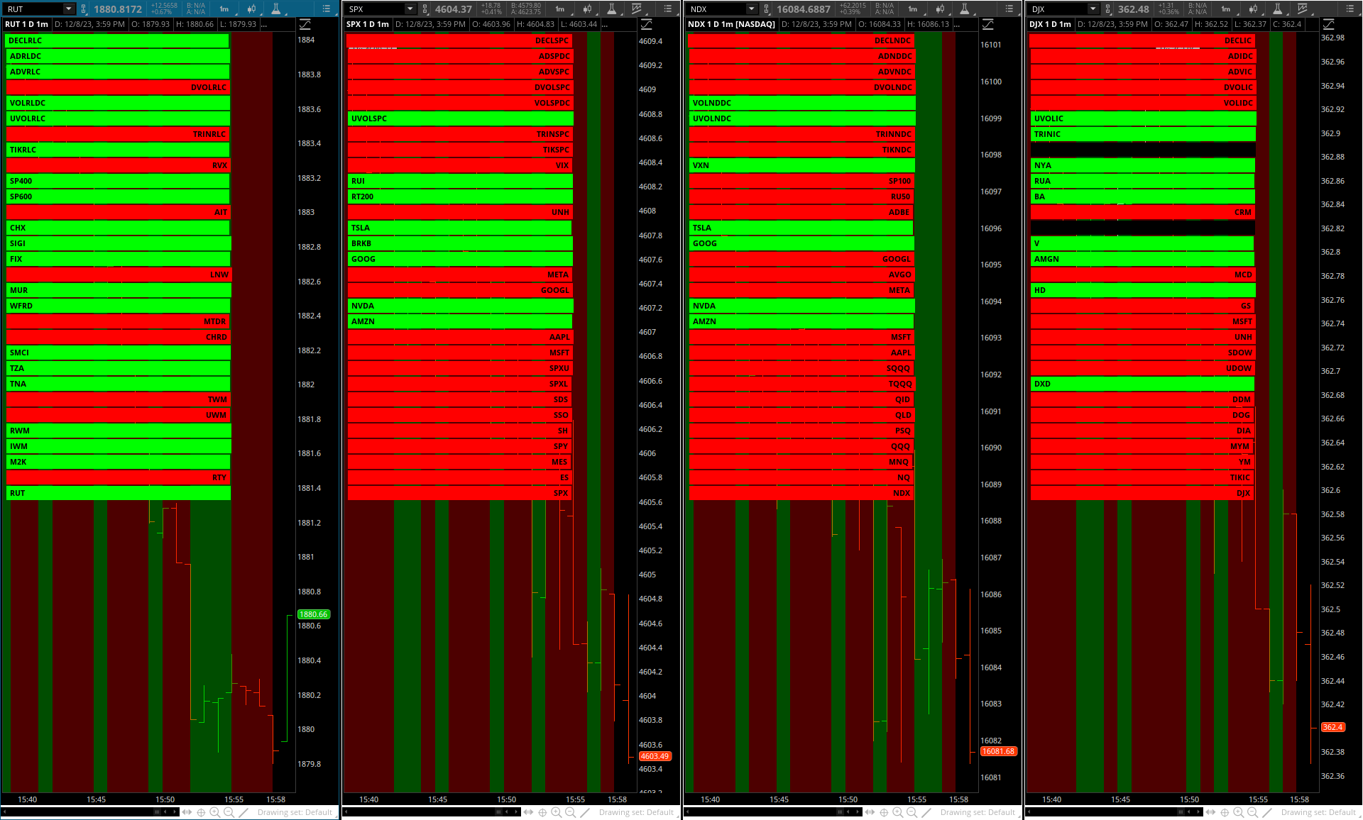
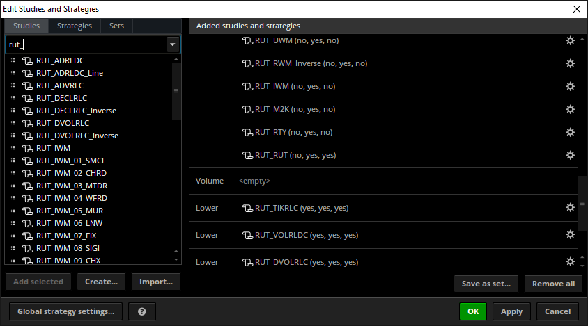
There are a total of 35 studies per Index (30 are shown, 5 in lower chart with display off):
Each study may be placed on its own chart.
https://tos.mx/pyLQtQJ
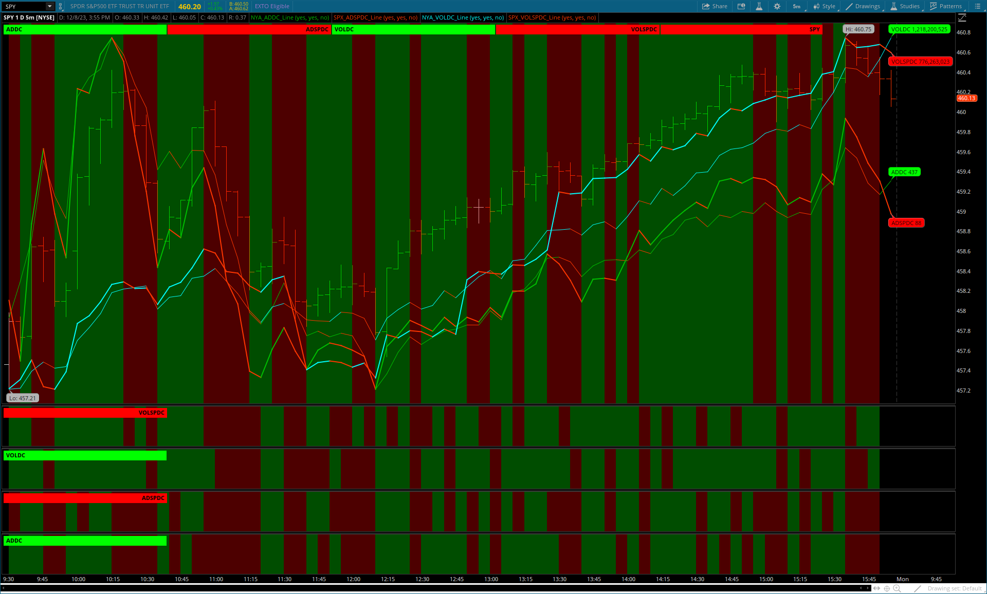
Example: various studies and settings displayed:
All studies have a prefix with the Index coming first so they are grouped/listed together:
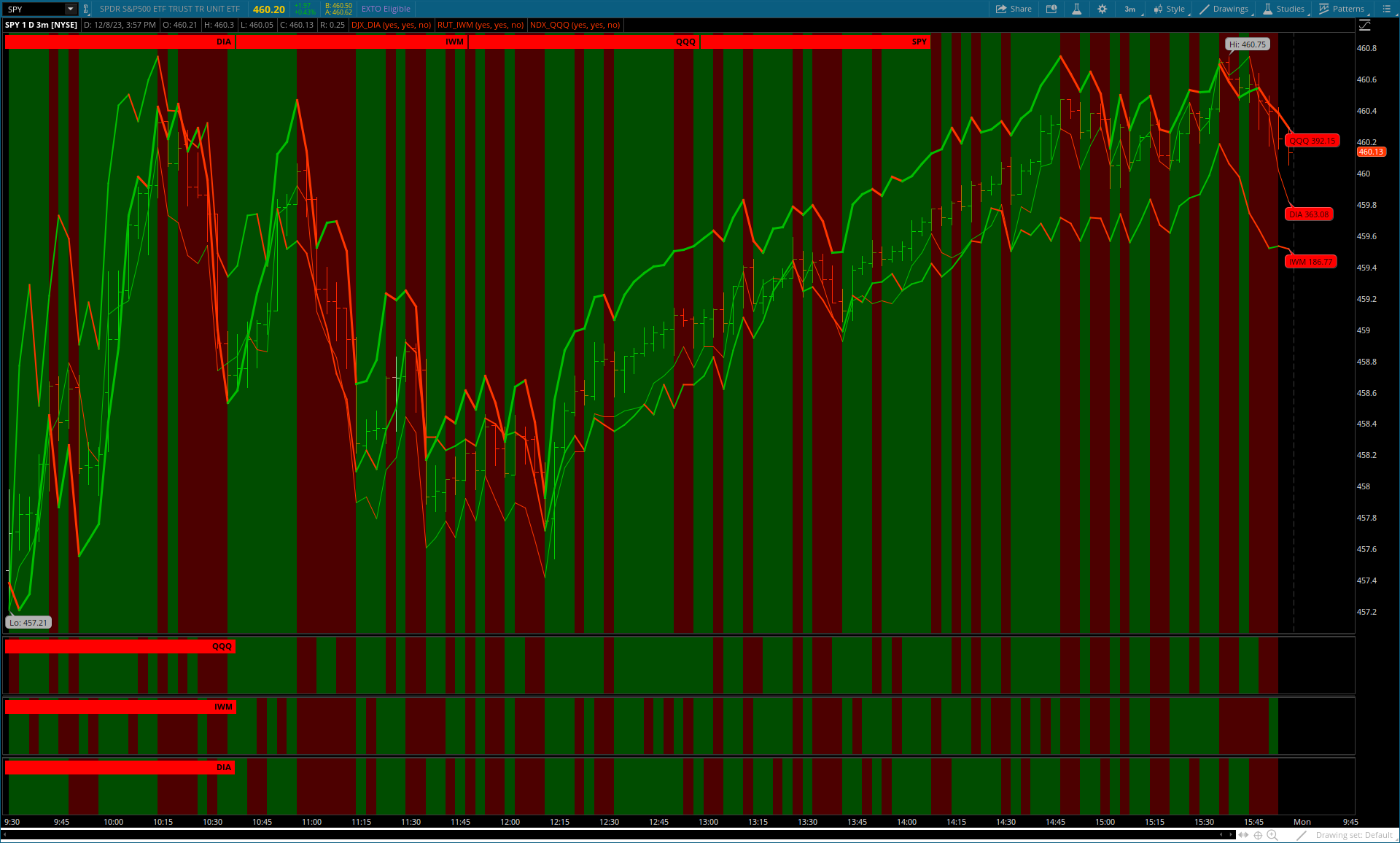
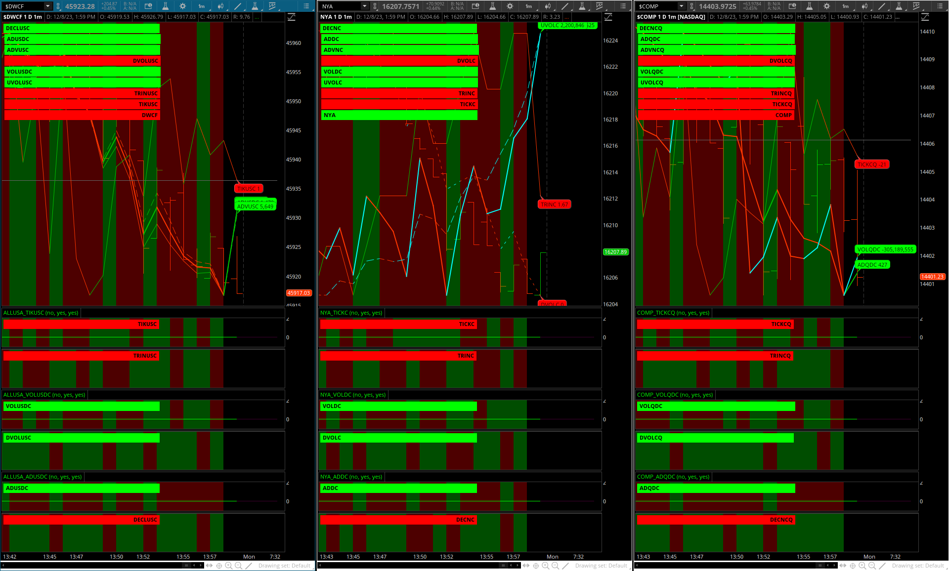
Here are 3 other Indices showing various studies displayed and the 5 studies in the Lower Study.
The grey horizontal line is the zero line on the <TICK>_Line study.
The included <TICKs> study in the Lower pane would have a green/red line, explained later).
https://tos.mx/5VLgEH8
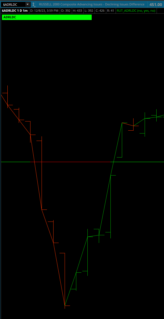
2 studies are not inverted (declining issues and volume).
The 3 studies that cross the 0 line behave 'differently' than the 30.
All 5 are included for a complete Market Internals package.
When the 3 are placed on their own chart they have a zero horizontal line that changes green/red when the symbol crosses 0.
The declare lower; affects this and thus has been removed for the 5.
(ex.: TICKs, Advance-Decline Difference and Volume Difference).
Note: In Chart Settings > Price Axis > Fit Studies must be off:
The key to using reference lines is having declare lower; placed in the scripts of the 30 studies .
Once the study is added to a new chart it must be dragged into the upper study in the Edit Studies and Strategies window.
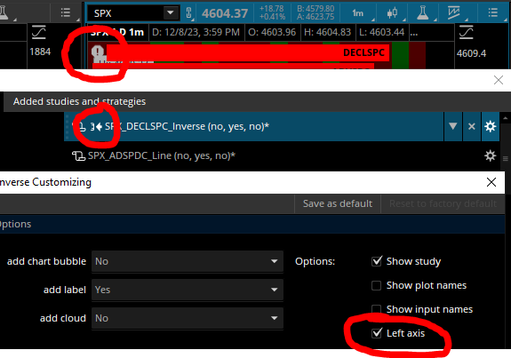
A Left Axis warning ( ! ) will appear to the left of the Label. To remove it uncheck the Left Axis:
Studies with just the Cloud on in the Lower pane is a nice way to perform historical analysis to see what internals/symbols move in correlation.
Note: Any changes to the settings in the studies you will need to name/rename the study otherwise the order will become random.
Name example: RUT Composite and then reload the study to your chart.
Wish list: ability to move the Chart Bubbles horizontally and vertically w/o losing the red/green function, possibly with a line that acts correspondingly.
Each study has a Chart Bubble, Cloud, Label and Line with on/off display and each will change color: up = green, down = red.
The Lines act as reference lines with Chart Bubbles as absolute values.
1min. | 3 min. | 5 min. time frames shown:
shared link: https://tos.mx/f0xTaFt
There are a total of 35 studies per Index (30 are shown, 5 in lower chart with display off):
Emini, Emicro, 6 long/short ETFs, Top 10 stock holdings per Morningstar, 2 similar-in-size indices and the 9 market internals.
DJX does not have a volatility symbol so $DXY Inverse is used.
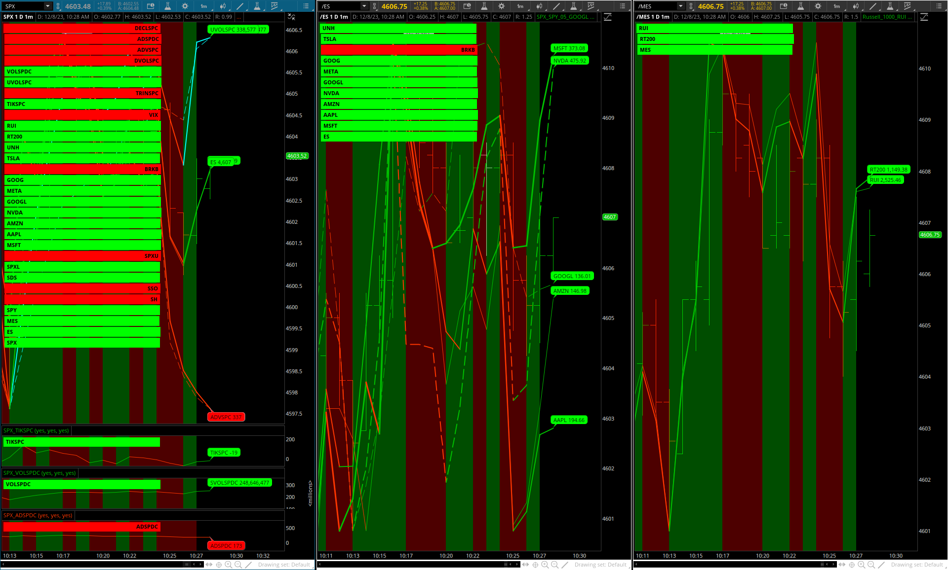
In the image all Labels are on and the Index Cloud is on, all Chart Bubbles and Lines are off.Each study may be placed on its own chart.
https://tos.mx/pyLQtQJ
Example: various studies and settings displayed:
All studies have a prefix with the Index coming first so they are grouped/listed together:
Here are 3 other Indices showing various studies displayed and the 5 studies in the Lower Study.
The grey horizontal line is the zero line on the <TICK>_Line study.
The included <TICKs> study in the Lower pane would have a green/red line, explained later).
https://tos.mx/5VLgEH8
2 studies are not inverted (declining issues and volume).
The 3 studies that cross the 0 line behave 'differently' than the 30.
All 5 are included for a complete Market Internals package.
When the 3 are placed on their own chart they have a zero horizontal line that changes green/red when the symbol crosses 0.
The declare lower; affects this and thus has been removed for the 5.
(ex.: TICKs, Advance-Decline Difference and Volume Difference).
Note: In Chart Settings > Price Axis > Fit Studies must be off:
The key to using reference lines is having declare lower; placed in the scripts of the 30 studies .
Once the study is added to a new chart it must be dragged into the upper study in the Edit Studies and Strategies window.
A Left Axis warning ( ! ) will appear to the left of the Label. To remove it uncheck the Left Axis:
Studies with just the Cloud on in the Lower pane is a nice way to perform historical analysis to see what internals/symbols move in correlation.
Note: Any changes to the settings in the studies you will need to name/rename the study otherwise the order will become random.
Name example: RUT Composite and then reload the study to your chart.
Wish list: ability to move the Chart Bubbles horizontally and vertically w/o losing the red/green function, possibly with a line that acts correspondingly.
Last edited by a moderator: