Darth Tradicus
Member
Hey everybody,
This is a simple utility indicator I made for personal use that I've gotten kind of addicted to. I made a version of this for another indicator on the boards but wanted to make it a stand alone so I can add it anywhere.
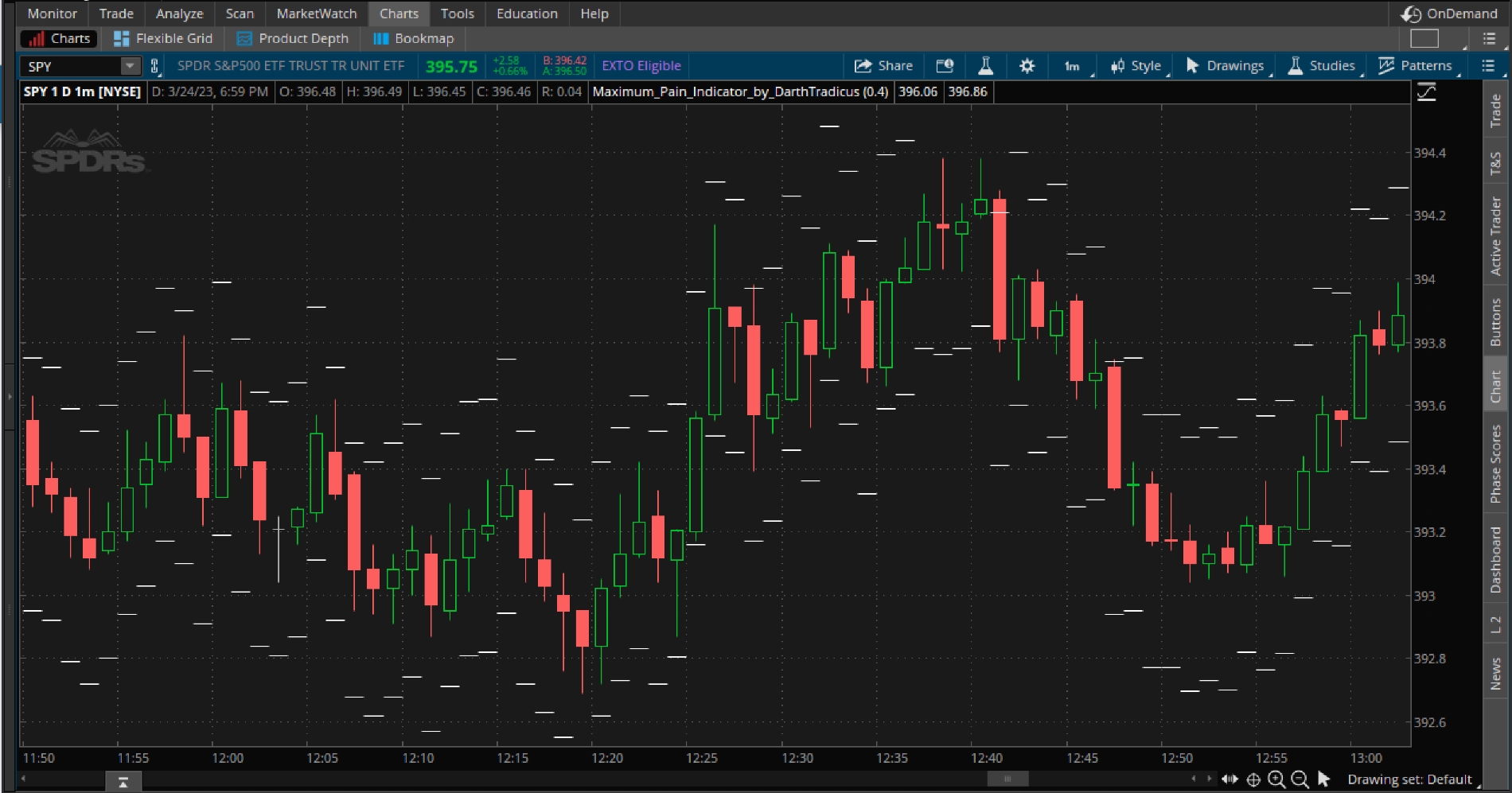
The purpose of this indicator is to help you quickly identify where your maximum monetary risk(pain) is located at any given candle. With volatility growing/shrinking, the chart constantly adjusting candle lengths and price to fit the screen, and on crazy days like FOMC, it is sometimes hard to know or quickly figure out exactly where you need to be to play things safe.
https%3A//i.imgur.com/fY6RbOp.jpg[/img]']

Basically just enter your max risk in the settings. The dashes above/below the candle is your max risk measured from the candle close -dash above for shorts, dash below for longs. In the chart image above, max risk is set to .40 cents which figures to be approximately $20 on the contracts I trade (Delta approx. .50 cents). So a quick glance at the chart tells me exactly where a $20 loss is at.
I figured I'd share since it's helped me out a lot. Its great for trading breakouts and pullbacks, especially on faster candles. Quickly identify where your maximum pain is at in relation to the last swing low/high where you would typically put your stop. Helps to see if you need to play your stop tighter, give you peace of mind to make the trade if you see you have a lot of room, or help to quickly decide if a trade is too risky and you should stay out altogether.
Enjoy!
This is a simple utility indicator I made for personal use that I've gotten kind of addicted to. I made a version of this for another indicator on the boards but wanted to make it a stand alone so I can add it anywhere.
The purpose of this indicator is to help you quickly identify where your maximum monetary risk(pain) is located at any given candle. With volatility growing/shrinking, the chart constantly adjusting candle lengths and price to fit the screen, and on crazy days like FOMC, it is sometimes hard to know or quickly figure out exactly where you need to be to play things safe.
https%3A//i.imgur.com/fY6RbOp.jpg[/img]']
Basically just enter your max risk in the settings. The dashes above/below the candle is your max risk measured from the candle close -dash above for shorts, dash below for longs. In the chart image above, max risk is set to .40 cents which figures to be approximately $20 on the contracts I trade (Delta approx. .50 cents). So a quick glance at the chart tells me exactly where a $20 loss is at.
I figured I'd share since it's helped me out a lot. Its great for trading breakouts and pullbacks, especially on faster candles. Quickly identify where your maximum pain is at in relation to the last swing low/high where you would typically put your stop. Helps to see if you need to play your stop tighter, give you peace of mind to make the trade if you see you have a lot of room, or help to quickly decide if a trade is too risky and you should stay out altogether.
Enjoy!
Code:
# Maximum Pain Indicator - Max Risk from Candle Close
# /Darth Tradicus
# Purpose: to quickly see where your max loss is in relation to where you want to place your stop.

input MaxRiskfromPurchase = .4;
def na = Double.NaN;
def bn = barnumber();

def MaxActualBULL = (close - MaxRiskfromPurchase);
def MaxActualBEAR = (close + MaxRiskfromPurchase);

def MABU = if bn == 1 then na else if close[0] then MaxActualBULL else MABU[1];

def MABE = if bn == 1 then na else if close[0] then MaxActualBEAR else MABE[1];

plot priceMAXup = MABU;
priceMAXup.SetPaintingStrategy(PaintingStrategy.HORIZONTAL);
priceMAXup.SetDefaultColor(Color.WHITE);

plot priceMAXdown = MABE;
priceMAXdown.SetPaintingStrategy(PaintingStrategy.HORIZONTAL);
priceMAXdown.SetDefaultColor(Color.WHITE);
