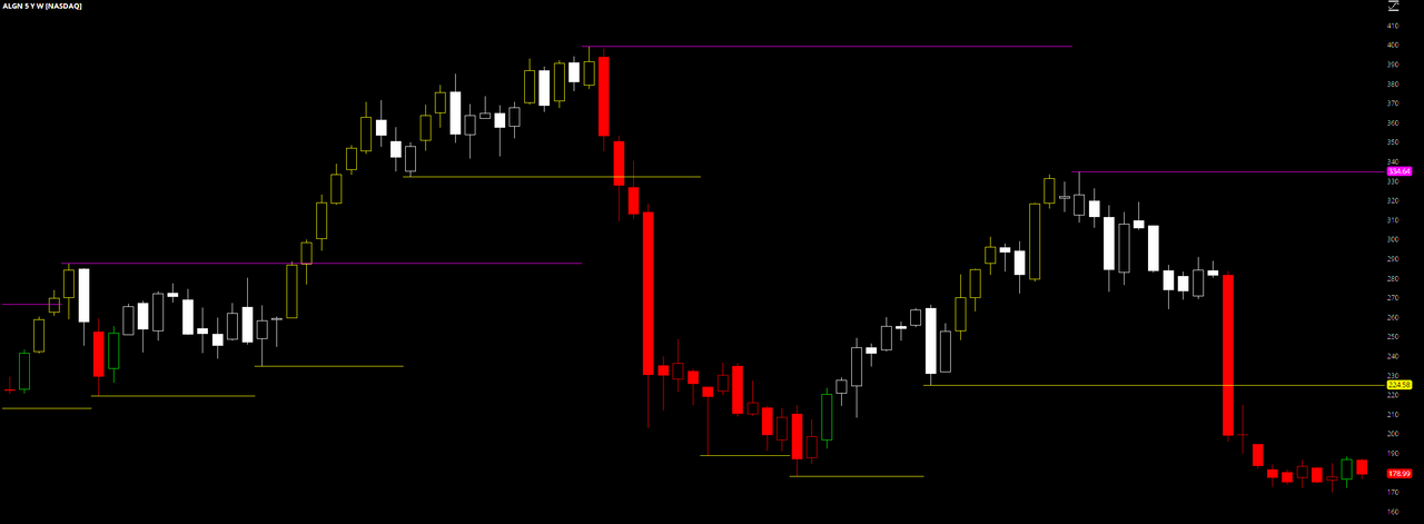
I thought I would share my own Long-Term Chart setup with you and the uTS community. I use a home-grown volatility study, a support/resistance study, generously shared by a fellow thinkscripter, and candlestick analysis whilst trying to extract wealth from the market...

Despite my best efforts, I cannot get the colors properly displayed on the uploaded charts. Everything washes out. Not to be deterred, I dialed up the contrast and this is what I got...
Essentially, the faint yellow candles are long signals, red candles are short/sell signals, the green candles are cover signals and the white candles indicate chop/ranging/consolidation requiring further analysis on lower timeframes. The horizontal lines are the aforementioned support/resistance indications. The rest comes down to candlestick analysis...
This post is not what I hoped it would be, but I say if ya got lemons, make some lemonade
Good Luck and Good Trading...
Last edited by a moderator:
