Good afternoon
I was wondering if it was possible to make an indicator that would take into consideration the size of the first volume candle of the NY session (5, 10, or 15-minute time frame) and would plot the middle (50%) and high (100%) of that first candle, and have those lines drawn until the end of the session.
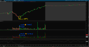
I do this manually every day as can be seen in screenshot
I'm also including a share link to my chart https://tos.mx/!tYkdn4fz

This is something that I draw and mark on my charts as a visual aid to highlight the size of the bars that reach or cross those two levels drawn from the first bar of the session. I'm using the Volume or Volumeavg from TOS to draw those lines, arrows, wedges, or dots.
And you could be able to select the opening (9:30 am) until, say, 3:50 pm, because the bars after that time are mostly for the MOC (Market on Close). Thank you very much in advance for your help.
green volume bars = close greater than close from 1 bars ago;
red volume bars = close less than close from 1 bars ago ;
I was wondering if it was possible to make an indicator that would take into consideration the size of the first volume candle of the NY session (5, 10, or 15-minute time frame) and would plot the middle (50%) and high (100%) of that first candle, and have those lines drawn until the end of the session.
I do this manually every day as can be seen in screenshot
I'm also including a share link to my chart https://tos.mx/!tYkdn4fz
- The indicator would also need to place a Wedge or Dot above each volume candle that closed at or above the middle line (50%),
- for each green volume candle that met that condition a cyan wedge (dot) would appear,
- and for each red volume candle a magenta wedge (dot).
- In the case that a volume candle closed at the high line (100%) or above that line, a wedge (dot) would appear on that candle,
- in this case, if the candle was green a green wedge (dot),
- and if the candle was red a red wedge (dot).
This is something that I draw and mark on my charts as a visual aid to highlight the size of the bars that reach or cross those two levels drawn from the first bar of the session. I'm using the Volume or Volumeavg from TOS to draw those lines, arrows, wedges, or dots.
And you could be able to select the opening (9:30 am) until, say, 3:50 pm, because the bars after that time are mostly for the MOC (Market on Close). Thank you very much in advance for your help.
green volume bars = close greater than close from 1 bars ago;
red volume bars = close less than close from 1 bars ago ;
Ruby:
#
# Charles Schwab & Co. (c) 2007-2024
#

declare lower;
declare zerobase;

input length = 50;

plot Vol = volume;
plot VolAvg = Average(volume, length);

Vol.SetPaintingStrategy(PaintingStrategy.HISTOGRAM);
Vol.SetLineWeight(3);
Vol.DefineColor("Up", Color.UPTICK);
Vol.DefineColor("Down", Color.DOWNTICK);
Vol.AssignValueColor(if close > close[1] then Vol.color("Up") else if close < close[1] then Vol.color("Down") else GetColor(1));
VolAvg.SetDefaultColor(GetColor(8));
Last edited by a moderator: