I hope I am making a noob error and that someone will see what I am doing wrong. I created a custom scan column that returns the percent change pre-market. The values are appearing in the column, but I am trying to format them as a percentage and change the colors with a label. I am doing something wrong. Any pointers on how to format the column correctly would be appreciated.
Here is my working code that populates the custom column on my quotes screen.
Code:
input showPriorCloseBasis = yes;
input marketopen     = 0930;
input marketclose    = 1600;
input dayend         = 2359;#end of day
input dayopen        = 0000;#beginning of new day
def c                = close;
def closepd          = close(period = AggregationPeriod.DAY)[1];
def closetd          = close(period = aggregationPeriod.DAY);
def closeam          = if SecondsFromTime(marketclose) > 0 and
                          SecondsTillTime(dayend) > 0
                       then c
                       else closeam[1];
def closepm          = if SecondsFromTime(dayopen) > 0 and
                          SecondsTillTime(marketopen) > 0
                       then c
                       else closepm[1];
def closerth         = if SecondsFromTime(marketopen) >= 0 and
                          SecondsTillTime(marketclose) >= 0
                       then c
                       else closerth[1];

Def PremarketChangePercentage = (100 * (closepm / closepd - 1));

plot PMChange = PremarketChangePercentage;
I hope I am making a noob error and that someone will see what I am doing wrong. I created a custom scan column that returns the percent change pre-market. The values are appearing in the column, but I am trying to format them as a percentage and change the colors with a label. I am doing something wrong. Any pointers on how to format the column correctly would be appreciated.
Here is my working code that populates the custom column on my quotes screen.
Code:
input showPriorCloseBasis = yes;
input marketopen     = 0930;
input marketclose    = 1600;
input dayend         = 2359;#end of day
input dayopen        = 0000;#beginning of new day
def c                = close;
def closepd          = close(period = AggregationPeriod.DAY)[1]...
I hope I am making a noob error and that someone will see what I am doing wrong. I created a custom scan column that returns the percent change pre-market. The values are appearing in the column, but I am trying to format them as a percentage and change the colors with a label. I am doing something wrong. Any pointers on how to format the column correctly would be appreciated.
Here is my working code that populates the custom column on my quotes screen.
Code:
input showPriorCloseBasis = yes;
input marketopen     = 0930;
input marketclose    = 1600;
input dayend         = 2359;#end of day
input dayopen        = 0000;#beginning of new day
def c                = close;
def closepd          = close(period = AggregationPeriod.DAY)[1];
def closetd          = close(period = aggregationPeriod.DAY);
def closeam          = if SecondsFromTime(marketclose) > 0 and
                          SecondsTillTime(dayend) > 0
                       then c
                       else closeam[1];
def closepm          = if SecondsFromTime(dayopen) > 0 and
                          SecondsTillTime(marketopen) > 0
                       then c
                       else closepm[1];
def closerth         = if SecondsFromTime(marketopen) >= 0 and
                          SecondsTillTime(marketclose) >= 0
                       then c
                       else closerth[1];

Def PremarketChangePercentage = (100 * (closepm / closepd - 1));

plot PMChange = PremarketChangePercentage;
output functions have to be on their own line, not within a formula.
you could have removed
. plot pmchange =
and the remaining code,
. addlabel(yes,....
would have worked
well, your words made this post more confusing than it needs to be.
when asking questings, think about what you WANT to see and what is actually happening.
you want a column study, with numbers. ( and a % ?)
not a scan. a scan processes formulas and checks if the result is true or false.
you say you want to change colors, but colors of what? the number font or the background color?
what defines the percent change of pre market?
..from the open at 4am (or the first bar after then?)
..from the close of yesterday?
to the close of the last bar, before 9:30am?
why is closeam the close at night time and closepm is the close at 9:29 in the morning?
generally, you don't want to use >= on the end time. just >.
endtime is actually the start of the next bar, after the desired period.
... SecondsTillTime(marketclose) > 0 then
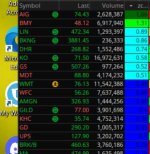
in a column,
..plot or addlabel() , controls the font color. i usually use black.
..use AssignBackgroundColor() to change the background color of the cell.
a lower study for experimenting,
i made it so every 0.5 % increase will have a different color. up to 6 colors
Code:
#column_color_per_lower

#https://usethinkscript.com/threads/addlabel-void-return-value-custom-scan-column.19411/
#AddLabel Void Return Value Custom Scan Column

declare lower;

input showPriorCloseBasis = yes;
input marketopen     = 0930;
input marketclose    = 1600;
input dayend         = 2359;#end of day
input dayopen        = 0000;#beginning of new day
def c                = close;

def closepd = close(period = AggregationPeriod.DAY)[1];
def closetd = close(period = aggregationPeriod.DAY);

def closepm = if SecondsFromTime(marketclose) > 0 and SecondsTillTime(dayend) >= 0 then c else closepm[1];
def closeam = if SecondsFromTime(dayopen) > 0 and SecondsTillTime(marketopen) > 0 then c else closeam[1];
def closerth = if SecondsFromTime(marketopen) >= 0 and SecondsTillTime(marketclose) > 0 then c else closerth[1];

Def PremarketChangePercentage = (100 * (closeam / closepd - 1));
#Def PremarketChangePercentage = (100 * (closeam - closepd) / closepd);

plot PMChange = PremarketChangePercentage;
PMChange.setdefaultcolor(color.black);

# % increment number, for choosing colors
def per_sp = 0.5;

AssignBackgroundColor(
     if PMChange > 0 and PMChange < (1 * per_sp) then color.blue
else if PMChange > 0 and PMChange < (2 * per_sp) then color.cyan
else if PMChange > 0 and PMChange < (3 * per_sp) then color.green
else if PMChange > 0 and PMChange >= (3 * per_sp) then color.dark_green

else if PMChange < 0 and PMChange > (-1 * per_sp) then color.yellow
else if PMChange < 0 and PMChange > (-2 * per_sp) then color.orange
else if PMChange < 0 and PMChange > (-3 * per_sp) then color.red
else if PMChange < 0 and PMChange <= (-3 * per_sp) then color.dark_red
else color.white);

addlabel(1, round(PMChange,1) + "%", color.cyan);
#
--------------------------------------
a column study
if a watchlist has too many stocks, some values of this may be -100, and have the wrong color
if used a plot to display a number, so the column sorts correctly.
if you use addlabel(), then it is text, and sorts right to left, not left to right.
Code:
#zcolpercolor
#column_color_per_lower

#https://usethinkscript.com/threads/addlabel-void-return-value-custom-scan-column.19411/
#AddLabel Void Return Value Custom Scan Column

input showPriorCloseBasis = yes;
input marketopen     = 0930;
input marketclose    = 1600;
input dayend         = 2359;#end of day
input dayopen        = 0000;#beginning of new day
def c                = close;

def closepd = close(period = AggregationPeriod.DAY)[1];
def closetd = close(period = aggregationPeriod.DAY);

def closepm = if SecondsFromTime(marketclose) > 0 and SecondsTillTime(dayend) >= 0 then c else closepm[1];
def closeam = if SecondsFromTime(dayopen) > 0 and SecondsTillTime(marketopen) > 0 then c else closeam[1];
def closerth = if SecondsFromTime(marketopen) >= 0 and SecondsTillTime(marketclose) > 0 then c else closerth[1];

Def PremarketChangePercentage = (100 * (closeam / closepd - 1));
#Def PremarketChangePercentage = (100 * (closeam - closepd) / closepd);

plot PMChange = PremarketChangePercentage;
PMChange.setdefaultcolor(color.black);

# % increment number, for choosing colors
def per_sp = 0.5;

AssignBackgroundColor(
     if PMChange > 0 and PMChange < (1 * per_sp) then color.blue
else if PMChange > 0 and PMChange < (2 * per_sp) then color.cyan
else if PMChange > 0 and PMChange < (3 * per_sp) then color.green
else if PMChange > 0 and PMChange >= (3 * per_sp) then color.dark_green
else if PMChange < 0 and PMChange > (-1 * per_sp) then color.yellow
else if PMChange < 0 and PMChange > (-2 * per_sp) then color.orange
else if PMChange < 0 and PMChange > (-3 * per_sp) then color.red
else if PMChange < 0 and PMChange <= (-3 * per_sp) then color.dark_red
else color.white);
#
useThinkScript is the #1 community of stock market investors using indicators and other tools to power their trading strategies. Traders of all skill levels use our forums to learn about scripting and indicators, help each other, and discover new ways to gain an edge in the markets.
How do I get started?
We get it. Our forum can be intimidating, if not overwhelming. With thousands of topics, tens of thousands of posts, our community has created an incredibly deep knowledge base for stock traders. No one can ever exhaust every resource provided on our site.
If you are new, or just looking for guidance, here are some helpful links to get you started.
VIP members get exclusive access to these proven and tested premium indicators: Buy the Dip, Advanced Market Moves 2.0, Take Profit, and Volatility Trading Range. In addition, VIP members get access to over 50 VIP-only custom indicators, add-ons, and strategies, private VIP-only forums, private Discord channel to discuss trades and strategies in real-time, customer support, trade alerts, and much more. Learn all about VIP membership here.
How can I access the premium indicators?
To access the premium indicators, which are plug and play ready, sign up for VIP membership here.